|
I've written before about the importance of not assuming that your audience speaks the language of your interface design. This is a photo of my friend's Dutch washing machine. Knowing my interest in the design of everyday things my friend asked me to open the door. As you can see there is no physical door opening mechanism on or near the door itself. Look at the buttons on the control panel. They look the same and the labels are in Dutch. Which one opens the door? Ok I got it after a few minutes because 'duer' sounds like door in English. I got lucky but what if a person whose language bears no resemblance to Latin or Germanic languages was trying to operate this machine? A more straight forward solution would be to place a door icon below the label. An even simpler solution would be to put a door handle on the door itself. 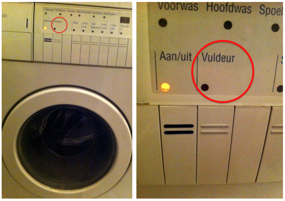 'Vuldeur' opens the washing machine door. Who knew!
2 Comments
Today I’m going to talk about the situation where Agile development has already, or is about to commence. That is, where much of the product vision, ideation, requirements, initial research and design direction have been completed in advance. In my experience Agile will not work otherwise. Here are some tips that the UXer can take on board to make sure things run smoothly for the project. 1. Be Prepared If you have not worked with Agile before, educate yourself about the inner workings of the methodology. Buy a book, go on a course, ask colleagues about it. That done, work closely with the Product Owner to refine the backlog, understand what they would like to prioritize. Within the UX team itself it is vital to properly estimate the work, break down and delegate tasks accordingly. Be aware of Sprint start and end dates and interdependence of development work on your output. 2. Don't be a bottle neck The single most important thing is make sure you design the UX at least one Sprint ahead of development. Your job is to ensure that your output is ready to be ingested when the Sprint starts. The interaction design and visual design should be delivered together so the Sprint can focus on building a shippable segment of the software. Manage your own time effectively. Remember it is very likely that you will have to dedicate some time to answering questions or making clarifications to designs you delivered in the last Sprint. 3 Make it easy for coders and testers In my experience, having screens that are representative of the final product is far better than referring coders and testers to individually designed components spread out over dispersed locations or documents. You really don't want developers and testers to spend their time pulling together wireframes and visual design components. This is not the best use of time and is an error prone process. Make sure your specs are easily accessible and all resources are in the one place. I have seen an online wiki working better than folders on a server. 4 Conduct a line-by-line handover Conduct the mother-of-all-handovers at the start of the Sprint. This should involve UX, Visual Design, the Product Owner, Development and Testers. Try to do this with all parties in the room at the same time if possible. The aim is to make sure that everyone is clear about the acceptance criteria, to rationalize your designs, to identify gaps in the specs and to outline what areas of your designs are in of scope for the sprint. You'll notice that by doing this at the start of the sprint, it will save on questions being asked throughout the sprint, freeing up your time to design for the next sprint. It might sound obvious but it is also a great idea to make sure people know how to read your specifications. Simple things like how you show different states of the same page could be confusing unless you go through it. 5 Be on call Sit on the same floor with the Dev team or Test team for as much time as you can. This might take you away from your fellow UXers but it is easier to answer questions and provide clarifications in this way. Check-in with coders and testers periodically, do it one a person-to-person basis. Be proactive, call over to their desk and don’t wait till the sprint is nearly over to get involved. 6 Be pragmatic Sometimes it's only when a developer sits down at a task that we discover things need to be done differently, affecting the UX. In this event, take a look at the alternative solution, the impact on the user experience and the timescales involved. I'm not telling you to surrender your design goals but be pragmatic; it’s worth picking the battles you really want to fight. Consider the 80:20 rule. If the alternative design delivers 80% of the experience, then great. Do you have any points you would like to add? Feel free to add comments.  The car sharing company Green Wheels provides a fantastic alternative to owning a car in Amsterdam. I've spent many a happy kilometer behind the wheels of their little red Peugeots. That is however, if I manage to book the time slot I wanted. It's not that availability of the cars is low. It's actually because the app's confirmation screen shows start and end times that are one hour earlier than you selected on the initial booking screen. For example, I wanted to begin my hire period at 2.15pm. Knowing about this bug, I adjusted my start time to 1.15pm on the booking screen. This meant that 2.15pm was then presented on the app's confirmation screen. Still with me? But just you wait til the confirmation email arrives. It shows 1.15pm as the start time. Arghh. I've now learned to ignore the app's own confirmation screen and to trust my initial selection. This simple bug has not been addressed for quite a few months which leads me to believe that Green Wheels do not monitor the quality of their own app frequently enough. Maybe they're just waiting til the clocks change again for things to be alright again. 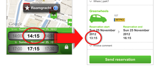 Left: Intended start time. Right: Incorrect time on the confirmation screen. After one too many sodas at my local cafe, I ventured in to the gents toilet. As I leaned back and waited for inspiration, so to speak, the peace was suddenly interrupted by a rasping whine. What was the source of this loud and startling noise taking place during that most sensitive of tasks? Nothing other than a fellow user of the rest room attempting to dry his hands. The jet engine responsible was the Dyson Airblade, moving air at 400mph and generating noise at 90dbA. In my opinion, a hideously modern grey box that looks out if place in even the most modern of lavvies. On the plus side it is very well designed from an ergonomic point of view and uses a quarter of the energy of traditional hand driers. Personally I prefer a more restful WC experience so give me paper towels any day. 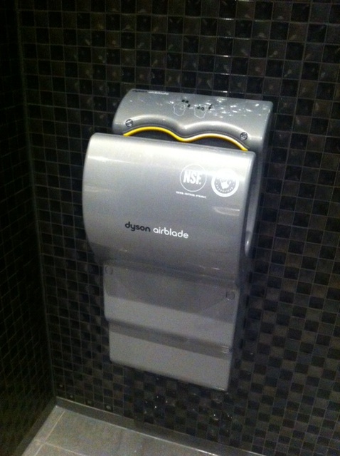 The startlingly noisy Dyson Airblade I've come across a petit frustration with Outlook recently. It seems to capitalize the first letter after you write i.e. or e.g. It also capitalizes the i but not the e. Strange. It means that I have to go back and edit the sentence every time. Somebody at Microsoft must have forgotten to add these commonly used abbreviations before releasing the product. Or maybe the chaps at Microsoft care too much for the English language and want to discourage the use of such abbreviations. Maybe I should write 'That is," or "For example" from now on.  Only recently has Lloyds TSB been over taken as the UK’s most complained about bank. It held the record for several years running and my personal experience with the bank can attest as to exactly why. I asked Lloyds to do something very simple for me that has now escalated into a 8 month battle to try and remove me accounts from their clutches. Here are just five areas where their customer experience fails. 1. No accountability Every time you call, a different relationship manager is assigned. This happens even if you request a certain individual. Each new person inevitably has difficulty understanding the back-story, the notes written by several other individuals and ultimately why you are so frustrated. Calls are dealt with on a once-off basis and there seems to be no concern over what happens to the issue or the customer thereafter. 2. Never proactive In my experience Lloyds TSB will not commit to calling you back, even when requested to do so on an important subject. It seems that making outgoing telephone calls and following up in a proactive manner is verboten at the bank. 3. Inconsistent knowledge One relationship manager will tell you that the process is X where as the very next one will tell you it is Y. It is very difficult to get to the true view of how the system works and what you are supposed to do to have your requests processed correctly. 4. Unreliable communication The various departments at Lloyds TSB Commercial Banking seem to work completely independently and do not communicate important outcomes to each other. Lloyds TSB is also a veritable Bermuda Triangle for Royal Mail and TNT. In frustration I once sent five copies of the same letter only for the bank to deny receiving any of them (and don’t worry I had the correct address). 5. Defensive rhetoric With only a few exceptions, relationship managers at Lloyds TSB tend to give generic and deflective answers. I've experienced one manager go on offensive in an aggressive fashion, which is never aceptable. Their policy also to refuse requests to be transferred to a supervisor. I was even told that it was not possible to wait until they were free to talk. All of this is very stressful, inconvenient and expensive to deal with especially when you live abroad. Therefore, Lloyds TSB commercial banking gets an NPS score of 0.  I bled for Apple this week. The sharp edge of the aluminum under-casing on my Magic Mouse made a tiny cut on my thumb when I tried to retrieve it from my pocket. Ok, I'm sure that many of you are citing user error in this case. Why oh why was the mouse in my pocket for a start? The reality is that in today's flexible office environments sometimes you have to pack up your stuff and move to another desk or meeting area. Having my hands full at the time I stuffed the mouse into my pocket for convenience, only for it to attack me when I tried to remove it from its cozy den. The paper-cut-like gash produced a surprising amount of blood but what hurt more was the feeling that an Apple product hadn't been designed well enough to prevent injury to its loyal owner. I shed a tear. 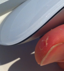
Overuse of lines, borders and shadows distracts instead of focussing users. Look at Facebook mobile21/9/2012 Yesterday I realized that my news feed on Facebook mobile was taking me a long time to digest. I needed to focus really hard to extract important information like people’s status updates and distinguish them from pages they liked or other activity. I realised that I had seen this issue before at Vodafone Group a few years ago. The Facebook news feed was suffering from something I like to call over-delineation. There are simply too many line dividers, shadow effects and borders on the page. Instead of helping us to divide and separate information, the use of so much delineation simply gives our eyes too much to process and makes it difficult to identify what is of value and what is not. The solution is to trust in the use of space, indentation and text emphasis to do the job. 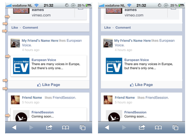 Left: Current Facebook newsfeed. Right: Facebook newsfeed with many of the dividers, shadow effects and borders removed. More scannable I'd say. So I had an idea. I thought it was gonna make me a millionaire. I drew prototypes of it on paper. I showed it to people who make their money in that industry. Unfortunately, it didn’t go down at all well. The idea was a simple calendar where recruiters can see the guaranteed-up-to-date availability of freelancers for weeks in advance. It turns out that most recruiters don't want to talk to freelancers that are available. More are focusing on headhunting, getting the best candidates to leave their current engagement for something more lucrative or more interesting. The perception is that if you’re available you can’t be that good. Fair enough but that gave me another idea. How about a service where you can only book a freelancer at the last minute? Even the best freelancers can have immediate availability should a project they are working on be cancelled for example. In any event, recruiters would have to be realistic about the perceived abilities of that freelancer given the tight deadlines of get someone sitting at a desk. I’m now gonna go away and prototype that idea, I’ll let you know how I get on. 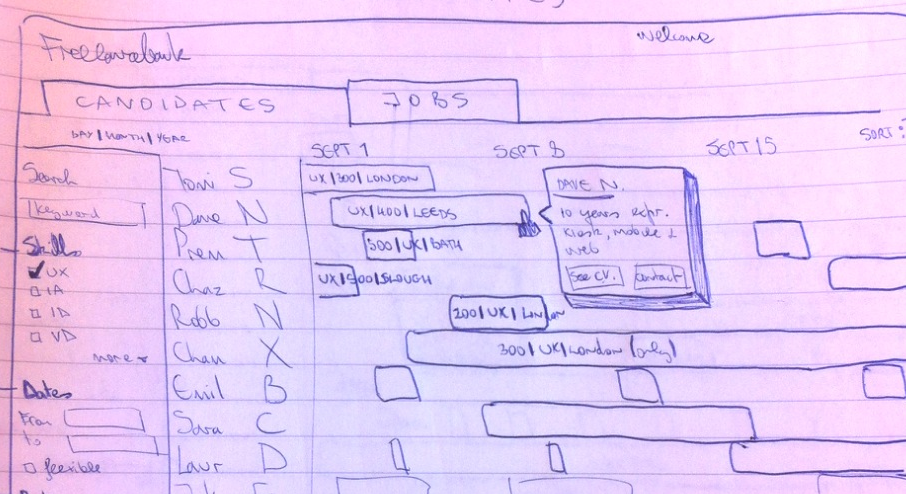 Paper Prototype. Calendar showing the guaranteed-up-to-date availability of freelancers. One word, Ryanair. The no-frills airline from the Emerald Isle has seen record profits this year despite defying that most sacred of UX matras. That is, great user experiences are Useful, Usable and Engaging. But thinking about it in more detail and I am reassured. Although Ryanair is a successful business it is not a successful user experience. In fact it is the most complained about airline in the world. “To hell with user experience” is possibly what Michael O’Leary, Ryanair’s outspoken CEO, might respond. After all, in the past he has acknowledged and also refused to apologise for the airline’s lack of customer service. The reality is however that Ryanair’s arrogance is bearable as long as they are able to offer destinations and prices that other airlines find difficult to compete with. Given a more even playing field things might be very different. The problem for Ryanair is that passengers might not forget their sneaky ways so quickly.  Michael O'Leary, Ryanair CEO Hello Tomorrow is the name of the latest intriguing campaign from Emirates airlines. Ironically it is practically impossible to say Goodbye to their email newsletter. Clicking on the ‘unsubscribe’ link brings you to a page on the Emitates web site that asks you to login with your email address, first name and surname. All of which are compulsory and need to be entered exactly. Surely they could detect that you are accessing the unsubscribe page from the email inbox that is subscribed to the newsletter in the first place? Oh no, that’d be too easy. Upon successfully logging in, you not only have to untick the items you wish to unsubscribe from but you also have to tick an additional ‘unsubscribe from all Emirates emails’ check box. Frustrated yet? The final step is to enter an annoying captcha. If Emirates want to retain subscribers they would be well advised to drop the onerous process and replace it with a polite and more human question such as “Are you sure you wanna go? We will miss you".  Emirates presents a very frustrating process for unsubscribing from their email newsletter. In some of the more user-focused companies I have worked with, UX has had input into things outside its immediate realm such as advertising campaigns or product packaging. I’ve already discussed how UX can lend all-important practicality to such things. More often than not however the product manager or the marketing team have the final say and can overrule UX input. I have seen this happen even after escalation to senior management. Admittedly strong leadership is important. Products need to meet launch deadlines and budgets but nonetheless, many products have gone to market with known issues that detrimentally affect the customer experience. There are many ways for you as a UXer to counteract this. Traditionally I would have advised you to foster good relations with the decision holders, be assertive in a constructive fashion, be clear about the impact of an issue and try to quantify it in language that they will understand e.g. more customer support calls. Unfortunately this is not always easy to do. But I need to ask a critical question at this point. Is it not unreasonable nowadays to expect that they should just ‘get it’, especially given the patency of why devices like the iPad are so successful? The intangible, the x-factor, that je-ne-sais-quoi is often what people value or cherish most. How would you quantify the love between two people in percentages and flow charts? If you love your products and your customers then UX is the answer.  While withdrawing cash from a machine in Amsterdam recently I suddenly realised the importance of designing for people that speak, or do not speak, different languages. This is especially the case in a city such as Amsterdam that us overflowing with tourists and ex pats who work there, such as my good self. For example, ING bank machines do not offer the domestic card holder a choice of language. All instruction appears in Dutch. Fair enough you might say, if you insert a Dutch bank card you get Dutch instructions. But the card holder might not speak Dutch. When it comes to pin entry there is an image of a hand pressing numbers but no other prompt for you to begin entering the digits. This image caused me to delay slightly because it looked like it was simply advising me to shield my pin. I was waiting for something more unequivocal to prompt my action. A blinking cursor would have done the job. Or maybe four dots representing my pin number to encourage me to start typing. Should I just stop complaining about little things and go learn Dutch? 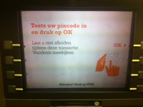 There's a great app from booking.com. It's called Tonight where you can book a room for that very night. Not for tomorrow night or for two weeks time, only for tonight. I've used it for last minute deals and saved heaps of cash. However it still puzzles me that hotels listed on the app offer a discounted non-refundable rate and also a normal rate. The normal rate is higher and allows you to cancel two or three days in advance without a penalty. Hello, users of Tonight are likely to be booking less than twenty four hours in advance. The cancellation policy could never apply so why offer it? Anyway my advice is to choose the no refundable rate and save yourself some dosh. 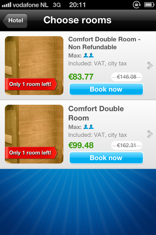 Why pay $16 more on same day hotel bookings? Ten years ago I wrote guidelines on how to design interactive voice response interfaces like voicemail and cinema listings. It pains me to find systems today that are as frustrating and difficult to use as they were back then. Take UK bank Lloyds TSB for example. I called them from abroad and spent 56 seconds spitting out my account number, sort code and date of birth before they told me that their service was closed for the day. Arghh. Just tell me the office is closed up front.
The UK phone network called 3 insists on reading out the telephone number of a caller before you listen to the message. Infuriating when someone from the Ireland calls only for them to decide not to leave a message in then end. Meanwhile I had to sit through an unnatural and slow automated voice read out the following 'Message from zero zero three five three eight seven X X X X X X'. Arghh again. Just play the message and let me determine if I need the number read out to me afterwards. I sometimes browse the App Store’s Top 25 or Featured lists, just to see if anything catches my fancy. Unless I’ve already heard good things about an app, the decision to enter the detailed description page is a combination of five factors. The app icon, app name, app publisher, rating and price. All too often apps limit their appeal by not addressing these factors effectively. Take Vyclone for example. It’s difficult to imagine what this app might entail when you look at its fabricated name and ambiguous icon. On the same list we have Captain Antartica. Its icon has a rocket propelled cartoon bird flying through the air and it is published by FDG Entertainment. You simply know it’s a game and can even imagine the kind of gameplay. Vyclone, in case you are interested, allows you to synchronise video taken by multiple people and mash them into one continuous video. Neat. However, Vyclone should have included some nuance of video in their icon and app name. Instead millions will see it in the list of featured apps and never dig any deeper. 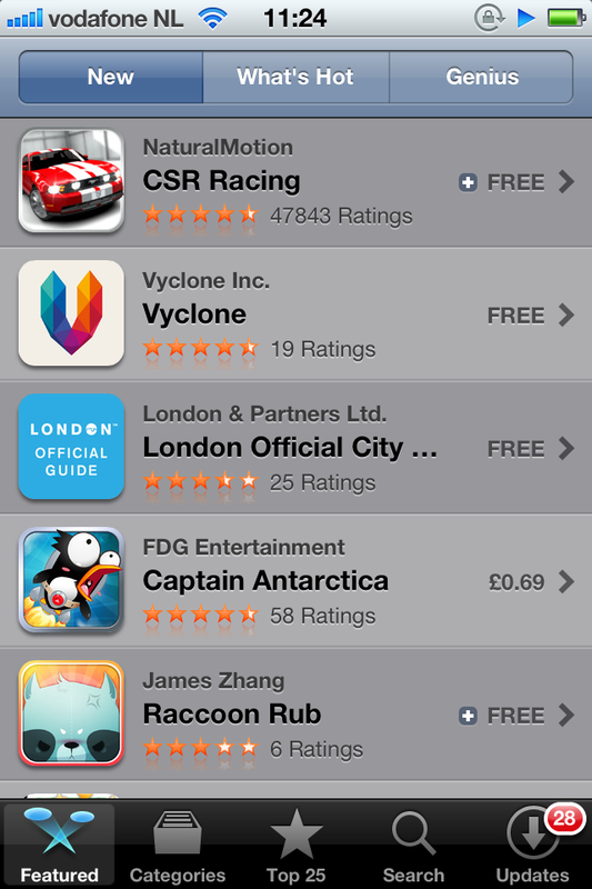 Can you guess what Vyclone is all about? Yes Facebook mobile is hiding something. It hides enough of an image in your news feed for you to miss the point of the image or to puzzle your friend's judgement for posting it there. The top and bottom of any given image is cropped. You can only see the full version by touching the image and going to a new page. How good would it be to be able to scroll the image in its placeholder so you can see the entire version? Difficult to do when scrolling is required to control the whole page but I'm sure some mechanism could be designed to do so. Any ideas?
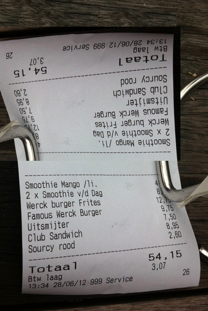
Press up if you wanna go up, right? Not so fast hombre. In my friend's building you press the down arrow to call the life DOWN to the ground floor. On the top floor you press the up arrow to call the life UP to the top floor. Even though there is only one button to press in both cases it's still worthy of a blog piece in my opinion. Who said UXers need to get a life? 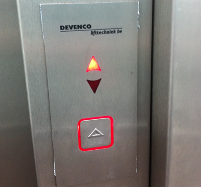 On the top floor there is one button which points upwards. Hardly intuitive. I want to go DOWN. Banner ads on YouTube are not so irritating anymore. However, having to sit through in-stream video ads before seeing the main content is infuriating. Some adverts allow you skip to the content after five seconds. I watch these until that option arises. The ones that do not have a skip option immediately make me choose another source for the video I want to watch. I do this knowing that Google only receives revenue if all or at least 30 seconds of the in-stream ad is observed. Many advertisers don’t realize that the first five seconds is where they should concentrate the brand, product shot and key message. It's a big challenge but do it right and it could represent free advertising. There are so many examples of doing it wrong, see below. Advertisers and agencies mistakenly think we will be as enamored with their ideas as they are and will watch the ad until the end. Ultimately, the pragmatism and understanding of customer behavior that UX brings could make advertising more effective. I had lunch today with a table of my favourite people. Being Amsterdam we decided to go Dutch, split the bill. We placed the bill on the table but people kept turning it around to see what they owed. So how about a bill that shows the amount in both orientations. OK, I admit that it would be an unusual, somewhat confusing concept to get used to and that it’d consume more paper and ink but think of the convenience, OMG the convenience. Check out my terrible photoshopped image of such an incredible incarnation.
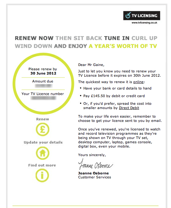
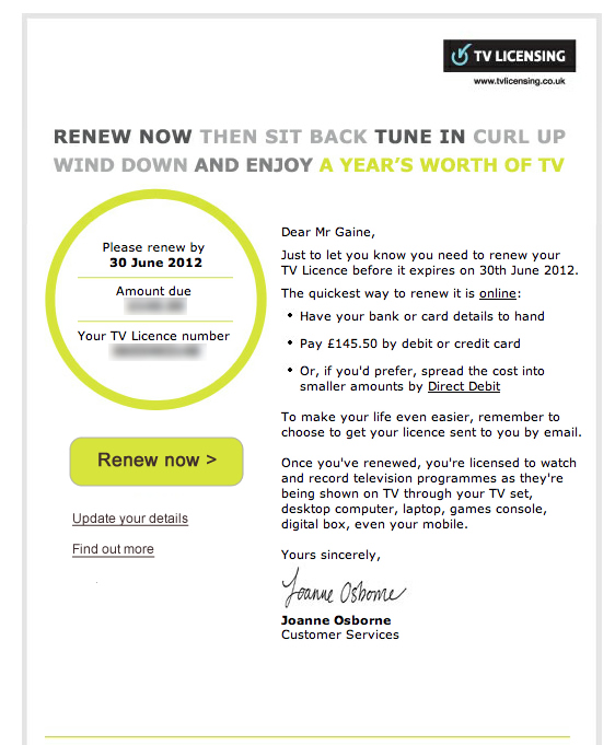
I know Karl for awhile. Recently he came along to my birthday celebrations and we realised we were not friends on Facebook. Shock horror. Karl's surname is difficult to spell so he helped me find him on Facebook on my phone. As we were looking at the screen together I pressed the 'Add friend' button. Immediately afterwards a dialogue popped up asking me to categorise Karl as a acquaintance or close friend. Awkward. Selecting close friend would not have felt right for both of us as we are in the process of getting to know each other and hanging out more. Whereas the word 'acquaintance' suggests that the relationship is somewhat nonchalant or 'slight' as Google would have it. The gap between acquaintance and close friend is too wide. Facebook's intention is to let you see less of an acquaintance's activity in your news feed. But why ask to classify that person there and then? Surely you will only want to make this decision when you see the nature of what they post. Their posts might mean that you get to like that person more and become close friends. Facebook would do well to simply let me add a friend and categorise them if I want to sometime later. 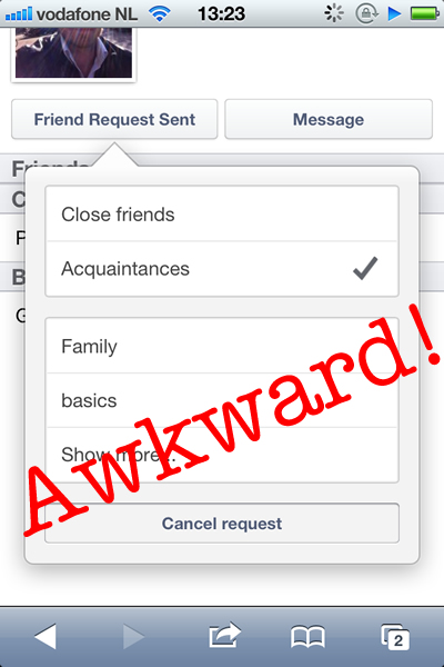 Adding a friend on Facebook mobile can be awkward. I’m one of those annoying people who think the UK TV license fee is worth every penny. Conveniently, the TV Licensing people sent me an email entitled ‘You've 14 days left to renew your TV Licence’. I opened the email, pondered over the fee amount for a while then decided to pay online. Where was the ‘pay now’ button? After some time I noticed a pound (£) icon with the word ‘renew’ written in tiny text above it. The icon did not look interactive because it was in the same circular style as the area housing the fee amount and my account number. There was also no prioritization of the icon. It was the same size as periphery options such as updating personal details and finding out more info. Surely the main aim of an email such as this is to get someone to pay as soon as possible and to do so in a polite manner (given that the TV license fee is a controversial issue). Anyway I’ve quickly mocked up how the email might work better by having a clearer 'renew' call to action. Did I succeed?
LEFT: Original TV Licensing email. RIGHT: Emphasizing the 'renew now' button
There are a number of on-demand car programmes in Amsterdam. You can pick up a car from an assigned parking slot and pay by the minute or kilometre. Some of these schemes are more obvious than others. Car2Go runs a fleet of blue and white electric Smart cars. I've seen them hooked up to dedicated charging points by luminous umbilical chords. An obvious livery and unusual car makes them stand out. However, I was only made aware of Green Wheels when my friend pointed them out. Ironic when they are literally on every street in the city. Why did I not notice them? The answer lies in the cars colour scheme and the marque used. Little red Peugeots are everywhere in Europe and Green Wheel's decals have done little to distinguish them from these other cars. My advice for Green Wheels, paint the doors a contrasting colour and quadruple the size of your logo. Simple. 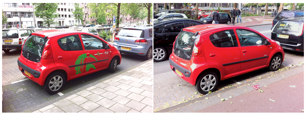 Green Wheels Peugeot 107 (left) and standard Peugeot 107 (right). So you want to change your app icon. Well you'd better think carefully about it or risk conversion and customer satisfaction. Let's look at an example. Tunein Radio is one of my fav apps. Recently they changed their app icon. However, not only did they change the colour of the icon they also changed the content or motif. The icon had been a distinctive block of dark blue which incorporated a radio metaphor and an accompanying smile. The updated icon changed the predominant colour to an ignorable grey as well as integrating a new motif. A motif which is as unintelligible as the London 2012 Olympics logo. Since the change I've struggled to find the Tunein Radio app in the sea of other icons on my phone's home screen. I've used it less and less, if at all. One less user for tunein radio then. 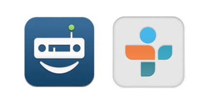 Tunein Radio icon: Old (left) and new (right) The impact of an unthinking change of app icon are manyfold. The obvious one is that the user will have difficulty in finding the app. The worst case scenario is that the user chooses a competing app because they can locate and comprehend the competitor's icon. The user gets acclimatised to using that app, buying through it and does not return to your app. Another impact is the prospect of upsetting your already satisfied customer.
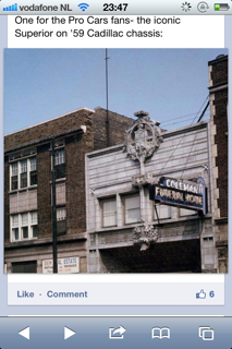
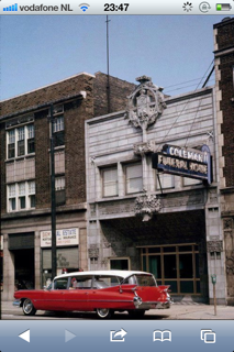
If you have to change your app you would be well advised to take a softly softly approach. Don't change the predominant colours and the motif of the icon at the same time. Change the colour first and then sometime after change the motif. Or visa versa. Allow people get used to the change. Take Fancy for example. Recently their app icon changed from grey to blue without changing the readily identifiable popsicle motif of the icon. The move away from grey can only be a positive step for its presence and visibility. Having said all of the above, maybe getting your icon design right in the first instance might be the best course of action. Coming to Amsterdam is a true visual feast. Pretty canals, unique architecture, very tall people, 'coffeeshops' and everything in between. One of the nicest surprises is that the Dutch seem to have held on to quite a number of classic cars which are parked randomly all over the city. They are in daily use too, no tax and low insurance makes them a viable option. I'm a big fan of car design and especially appreciate the classics. Concerns about aerodynamics and safety were not so front of mind giving more design freedom. I also have great memories of riding around in my uncle's canary yellow Mercedes from the 70s. I remember how bouncy the seats were and how the interior had that lovely old car smell. This got me thinking about nostalgia in design and branding. Would I buy a bicycle just because its branded Delorean? Hell yea, who wouldn't want to cycle back to the future. Would I prefer a note pad app to remind me of the blue lined copybooks that I used in primary school? Absolutely. Nostalgia is definietly one of the easiest ways to achieve seduction or engagement in your designs. Enjoy the gallery! |
WelcomeI'm Frank Gaine. Strategist, Designer, Manager, Founder, Educator. 
Archives
April 2022
|
 RSS Feed
