F R A N K G A I N E
  • Blog
  • Contact

O2 influences Nokia, or was it the other way around?

27/2/2013

2 Comments

 
In 2006 I designed the UX for a number of O2 branded phones. The O2 Ice was intended to be a stylish little number, the thinnest 3G phone on the market. The O2 Jet was a no nonsense business phone with incredible battery life, banishing superfluous functionality like the energy hungry camera. Low and behold, seven years later Nokia release the 206 and 105 that respectively channel the spirit of O2’s vision. The form factor, concept and feature set are strikingly similar. It’s nice to think we were ahead of our time (applause). Er, not quite. Although our hardware was more streamlined, the reality is that we were probably influenced by the simplicity of Nokia’s ubiquitous early designs such as the 1112 and the legendary 6310. You could say that these new low budget phones represent a return first principles for the Finnish manufacturer.
O2 Ice and the Nokia 206. Separated at birth?
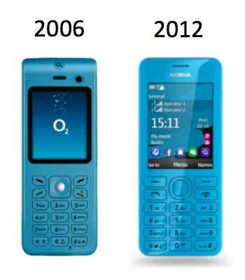
Left: The O2 Ice. Right: The Nokia 206.
2 Comments

Eight tips for designing an epic guided tour

15/2/2013

1 Comment

 
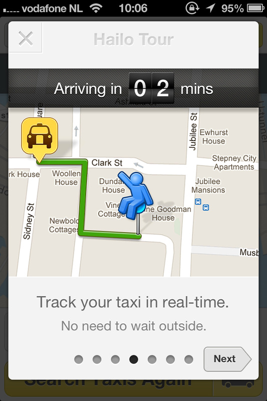
When someone downloads your application, should you provide a guided tour upon first time use? Some would say that by doing so, you’ve obviously not made your product intuitive enough in the first place. Bad UX, bad. On the other hand, I believe that a guided tour, done well, is more akin to the welcome you might receive at a fancy hotel. Ideally your guests will be excited about being there and are willing to hear more about the highlights of the experience that lies ahead of them. Here are some tips on how to provide a good guided tour.
  • Be clear about the objectives of the guided tour. Is it intended to show the process users should follow or just some highlights of the design? Design accordingly.
  • If you do provide a tour, don’t make it difficult to find (see Uber example below)
  • Allow users to skip the tour or exit at any time
  • An image or animation alongside a short text narrative works best
  • Make it obvious that that the tour is a sit-back-and-watch presentation or alternatively requires some interaction on the part of the user
  • Think, will the user know how to progress to the next and go back to the previous steps (e.g. swiping or tapping on a button)?
  • Provide a progress indicator and don’t make the tour too long. Five to seven steps as a maximum.
  • Additionally make the tour available in the Help or About section of your application so the user can revisit it at any point
Hailo taxi app: excellent guided tour
Hailo taxi app: Great example of a guided tour including a clear exit option and large image with text narrative.
Uber taxi app - invisible guided tour
Uber taxi app: The only indication that a tour exists is the 'Swipe up' call to action, presented in tiny lettering. Not so good.
1 Comment

    Welcome

    I'm Frank Gaine. Strategist, Designer, Manager, Founder, Educator. 

    I help organisations design compelling user experiences for their products and services that are commercially effective and a delight to use​.
    ​

    View my profile on LinkedIn

    Archives

    April 2022
    July 2018
    December 2016
    October 2015
    November 2014
    September 2014
    August 2014
    July 2014
    May 2014
    March 2014
    February 2014
    January 2014
    November 2013
    October 2013
    September 2013
    August 2013
    July 2013
    June 2013
    May 2013
    April 2013
    February 2013
    January 2013
    December 2012
    November 2012
    October 2012
    September 2012
    August 2012
    July 2012
    June 2012
    May 2012
    April 2012
    March 2012

    RSS Feed

    frank@netgaine.com
    @theUXswitch
    @netgaine
    LinkedIn 
Powered by Create your own unique website with customizable templates.
  • Blog
  • Contact