|
It's been almost three years since I wrote anything substantive on UX and the Design industry. I've been busy launching new businesses over at Mediahuis, Ireland's largest publisher. Working in the Start Up Studio is almost like having your own businesses, it's thrilling and all consuming. There are the highs and lows of course, especially when ideas that you where championing underperform in user testing or MVP launches. However, that's the beauty of honest research participants and objective performance indicators such as conversion data. You have to take a deep breath and move on to the next concept.
One product that did make it through the funnel operates in the professional education environment, it's called Learning Force. It started out with an ambition to carve out some of the global online education market, expected to reach $133bn by 2023. The original concept was to present learning from journalists who work for the world’s greatest newspapers as they discuss the most important topics of our time. Inspired largely by Masterclass. However, research told us that if users were going to spend their own money, or that of their employer, they wanted accredited courses. Having something 'to show' for their investment was critical. From the capability point of view, the product also felt too complex in terms of having to establish and maintain relationships with other publishers. When searching for a differentiator, research also told us that students were disappointed that many courses do not bridge the gap between theory and real-world practice. Therefore, Learning Force offers accredited courses from trusted third parties, overlaid with masterclasses from Mediahuis’s industry experts. The digital marketing courses also include the opportunity for students to pitch our Marketing department. A great thing to be able to say in an interview or put in one's portfolio. That was just a short reflection on some of my more recent activity. The power of research and speaking to industry stakeholders has never been as relevant. More updates to follow.
0 Comments
I'm delighted to continue writing about design and design careers, something I have been doing since 2001. Here is a list of my latest articles available on UXswitch.com's career advice centre. Designers need an Awesome LinkedIn Profile – 7 Top Tips Redesign the World Around You Enthusiasm Should Trump Experience When Designers Fight With Each Other Designers Need to Toughen Up Will UX Designers Become Obsolete? How to Become the King of UX Portfolios 5 Min Video: Top UX Career Advice Tips How Healthy is Your Design Team? Please read and share if you like what you see.  Designers need to toughen up and speak Business. I've been concentrating on writing for UXswitch. Articles revolve around UX career progression. Check them out. The best Design boss I ever had Questions to ask the interviewer at a design interview Stuck in your UX career? Things UXers and Recruiters Love About Each Other Top 5 Dos and Don’ts for your UX Portfolio Best Portfolios on UXswitch Onboarding Your New UXer Read more on UXswitch.com  Read more on UXswitch.com
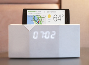
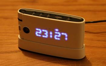
BEDDI alarm clock takes advantage of your favorite apps, smart home devices and more. So they say. Anyhoo, we were doing something similar with the O2 Cocoon in 2006 at O2 Branded Devices. The 'nest' allowed the phone to operate as a bedside alarm clock. It also doubleed as a charger and there was an additional plug-in aerial which allowed you to wake up to radio. Nice right?
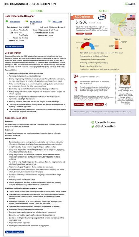
In my days at TomTom we were keen to innovate and bring new experiences to in-car navigation. However, preventing driver distraction was always first and foremost in our minds, carefully crafting the location and appearance of key information so that it was easily understandable at a glance. To this end, other factors such as the physical surfaces of the TomTom device itself were also very much considered. If the plastic used in the screen was too reflective then it would act almost like a mirror on a sunny day. The driver might see an echo of their own frustrated face rather than the navigation instructions. The use of matt surfaces also meant that direct sunlight should not bounce off the device and into the eye of the driver. I wish the guys at Renault had thought of that when putting together their latest Clio. To my horror, strong sunshine from behind my rented Clio reflected off the chrome speedometer surround, temporarily blinding me in the process. I had to take my hand away from the wheel and place it in front of the shining surround in order to prevent this hazardous distraction. The chrome sure looks nice but a more sensible approach would have been to, for example, use a mesh effect on the surround in order to disperse the light. Other than this life threatening UX fail, the little Clio was a delight. OK that might be an overly dramatic statement but safety should come first. 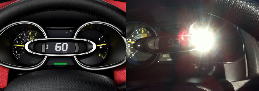 Left: Renault Clio instrument cluster in the brochure. Right: The chrome speedometer surround dangerously reflects sunlight from behind the vehicle. Recently, I heard from a friend in the States about an all together too familiar situation. A well intentioned but overly democratic Product Manager went and asked too many people for their opinion about a design accent on the hardware of a new product. The design accent was by no means radical, but it did represent a departure for the organization. The result of his constant polling and deference to the the lowest common denominator opinion was the removal of the design accent almost all together. The reason? "People either loved or hated it". He was aiming for consensus and ended up with a design that offends no one but that no one would love. Engendering any emotion is a rare and valuable thing. His bravery wavered to fight for what he originally believed in, failing to take a leap of faith. The result is a product is less likely to make a splash in a crowded marketplace or spark conversations between customers. It's also often the case that the fear of disappointing shareholders means that a leap forward is not taken, which ironically could have ignited the stock in return. 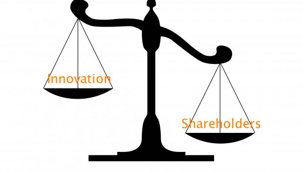 I was hungry and didn't want to leave the house. So I downloaded the much advertised Thuisbezorgd.nl app (takeaway.com in other countries). Searching through the unfamiliar local restaurants I couldn't help thinking that I'd like to have seen photos of the restaurant premises, inside and out. Visions of dirty kitchens shoveling out cardboard fare ran through my mind. Thuisbezorgd.nl would do well to offer some reassurance in this regard. The rating system is almost defunct as most restaurants seem to have a 4 star rating. Therefore, I chose a local restaurant that I had walked by previously and looked ok. Anyhoo, I ordered by credit card. They said that I'd be given updates by SMS. Then I waited. And waited. No SMS. I looked at my app to see the status of my order. Low and behold, there is no My Orders option in the app. I resorted to ringing the restaurant directly. They never got the order. Something went wrong somewhere. Net result, no pizza and I was still hungry. The bottom line is that Thuisbezorgd.nl should have an in-app order tracking option showing the order status: order received, in the oven, on the way etc. With options to cancel or increase the order if time allows. They should also be more proactive, following up on cases where delivery is waaaaay outside the normal delivery times. I did get a €7.50 voucher but am very hesitant to order again. Maybe I should not be as lazy and walk to a restaurant next time. 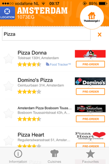 Text, text and more text That just about summarises most people’s experience of job descriptions. Bereft of even basic enhancements such as hyperlinks, text formatting and images. Far from allowing you to get a quick grasp of the role or remotely enticing you to apply, most job descriptions are all the same, bland and generally uninspiring. It takes more to impress a UXer UXers are particularly sensitive to the design of every day things such as job descriptions. So, what if we could humanise the job description in such a way that the remit, responsibilities and remuneration were easy to grasp and candidates were left longing to apply? Before and After We took a random job description for a UX Designer and applied the UXswitch magic to it. Making it more usable and human as we went. This meant thinking about the most important information and highlighting that in the design. We added some critical pieces of information that should have been there in the first place (such as salary) and replaced swathes of copy with images and text emphasis. We think the new design allows employers to stand out from the crowd and attract the attention of the UXers they are trying to find. Let us know what do you think. What did we miss? See humanised job descriptions we have created for Booking.com and Pokerstars.com. This will be easy to do UXswitch is working on a simple online form that contains all the fields that employers/recruiters need to fill out in order to provide the appropriate information for the humanised job description. Select a template. Enter text, upload images and insert links. Hit Submit and hey presto! A beautiful, responsive and engaging job description is created. Watch UXers queue up to join your team. UXswitch makes you look good Once you hit Submit, UXswitch will immediately provide you with a number of UXers from our members that fit your requirements exactly. UXers will also receive notifications of perfect job matches. You’ll get a dashboard allowing you to quickly compare these and any other UXer that applies. Share your tops pick with your client or integrate these candidates into your own database with ease. UXswitch makes life easier! Key features
 Humanising the job description After years of receiving calls and emails about UX jobs that were not quite right for me, I decided to something about it. I created UXswitch. What's that they say, necessity is the mother of invention? The idea is to make recruitment more human and efficient by matching a UXer's job wish list with only the top UX recruirers and employers. No more wasted effort. Simple really. And it's free (for now). The wish list contains information such as preferred income, location, perm/contract preference and availability. Recruiters or hiring managers are only accepted if their main focus is UX or they are recommended by UXers. They're also asked to treat candidates with respect and pay attention to our good recruiter guide. The site was created using an iterative user-centred design approach. Pencil sketches, wireframes and on device prototypes were tested with UXers and recruiters at every stage. UXswitch has already been described as disruptive and is being used by by hiring managers in Google, Uber, Vodafone as well as top UX recruiters from Amsterdam to San Francisco. UXers have taken to UXswitch is great numbers. It's really putting people in jobs and making looking for top talent much easier. The future holds further functionality roll out such as the world's first humanised job board. A place where only the most carefully crafted job descriptions live. Job descriptions with an awesome user experience. The intention is also to extend the model to other niche industries such as Project Management, Coders and more. "I have been trying to recruit a UX Designer for a client in Hampshire for a few months. I finally found a locally based candidate on UXswitch" I created my profile on Tuesday, and I have already got offers from 2 different recruiters yesterday and today. This works! Thanks a lot! :) 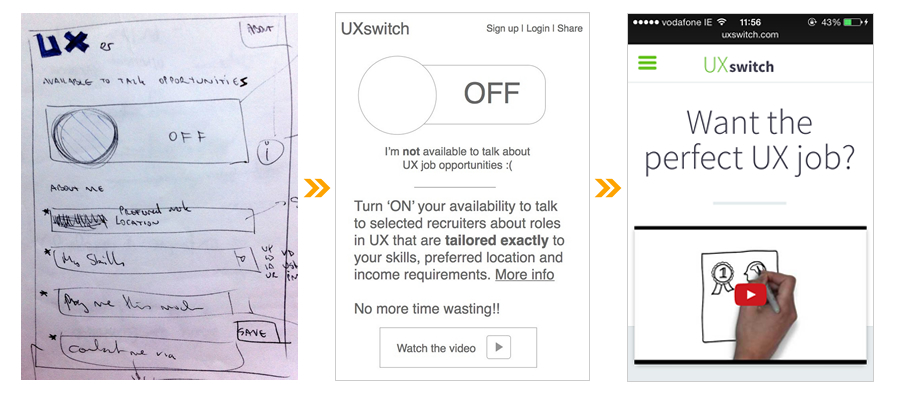 UXswitch from pencil sketches to fully launched mobile website. Refined by talking to end users at every stage. The concept of duality is inherent in everything about the Eurostar, the train that connects France and the UK via a magic undersea tunnel. Eurostar is equally French and British. For everything French, there is a British counterpart. This goes for the languages used on board, the magazines in the train vestibules and even the food served. This duality is ingrained and obvious to the user from the outset. So, when it came to finding a power outlet, this philosophy allowed me to solve my mini dilemma with ease, saving a few euro/pounds for Eurostar along the way. On my side of the table there was a three-pin UK power socket. I pondered, where do I insert my two-pin European plug? Applying the philosophy of duality and imagining the table as the sea dividing Britain and France, I surmised that the two-pin socket must surely be in the other side of the table. Et voilà! Correct. Admittedly a simple example, but it shows how a clear design philosophy can make it easier for users to apply and solve their little conundrums. This allowed the Eurostar to save money by not having to provide additional facilities. Although convenience would have dictated otherwise that more sockets be provided. Does your organization have a clear design philosophy? 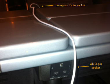 Duality is at the heart of everything about Eurostar. Bike lights are inevitably lost, stolen, break off, run out of batteries or otherwise stop working. Replacing them usually means a trip to the bike store, not easy given our busy working lives. What if you had a stock of inexpensive, easy to apply bike lights at home or even in your backpack? This is where a recent trip to the loo inspired a potential solution. To maintain hygiene and freshness, there is a product that allows you to stamp a gel disc onto the inside of your toilet bowl using a tube-like applicator. What if you could apply this concept to the bike light conundrum? Each applicator would have ten (non dissolvable) gel discs containing a red or white LED light and a small lithium ion battery within the gel itself. The back of the disc is adhesive and can stick to any surface, flat or rounded. If they fall off or stop working for some reason that’s no problem. Just pop another on there. 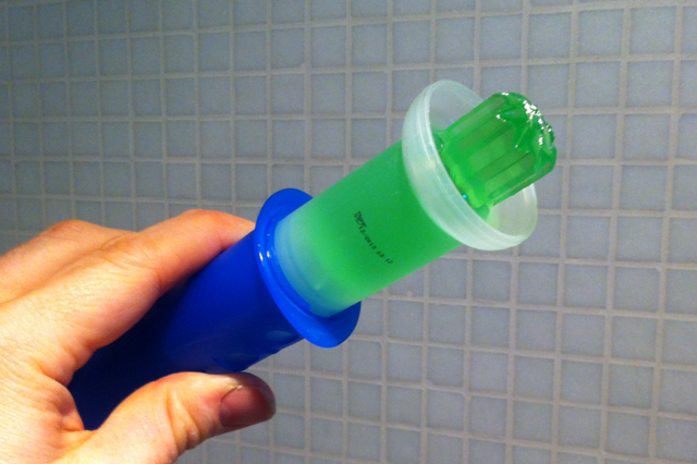
The gel disc applicator could be applied to disposable bike lights.
I recently bought my first North Face winter jacket, coming to the brand from years of wearing Timberland attire. It's wind and water proof, perfect for the Dutch climate. Generally the jacket is very good, except for one important aspect. The collar makes it uncomfortable to wear when the jacket is fully zipped up. It seems that the weight of the hood pulls the collar backwards, jarring it into the front of the neck and chin. The material of the collar in this area is rigid. The unyielding zip surround and lack of padding makes the jacket difficult to wear for long periods. Disappointing, having spent lots of hard earned Euros on it. On the plus side, my posture has improved as the collar forces my head and neck backwards, straightening my back. Didn't know that the jacket came with a silver lining.  The North Face McMurdo Parka. The rigid collar jars it into the front of the neck and chin. While waiting for a delayed friend at Schipol airport on New Year's Day, I noticed one of those automated massage chairs. The perfect solution I thought, for someone who had overindulged in the celebrations of the previous evening. Simply put, it was the best €2 I’ve ever spent. It was quickly followed by another deposit that bought me five more glorious minutes. A screen on the roof of the enclosure projects mountain scenes accompanied by monastic chanting. Like the best massages, I felt lighter after getting up from the massage chair. Revitalised, as the chair had advertised. While the calves and the buttocks are slightly pinched and nudged, it must be said that the real focus is on the person’s back. However, not feeling like a wally is the main issue. Sitting in the the bright orange open-sided elliptical box, it’s difficult to ignore people peering in at your monarchical recline while they wait for their loved ones in Arrivals. I had also combed the airport looking for €2 coins, not noticing the drab grey box affixed to the side of the massage chair that spelled out ‘CHANGE’. Although this might have been my post New Years Eve haze more than anything else. 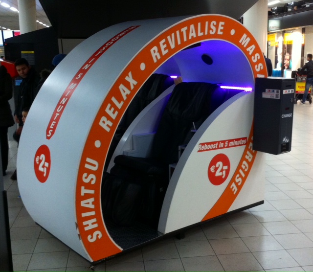
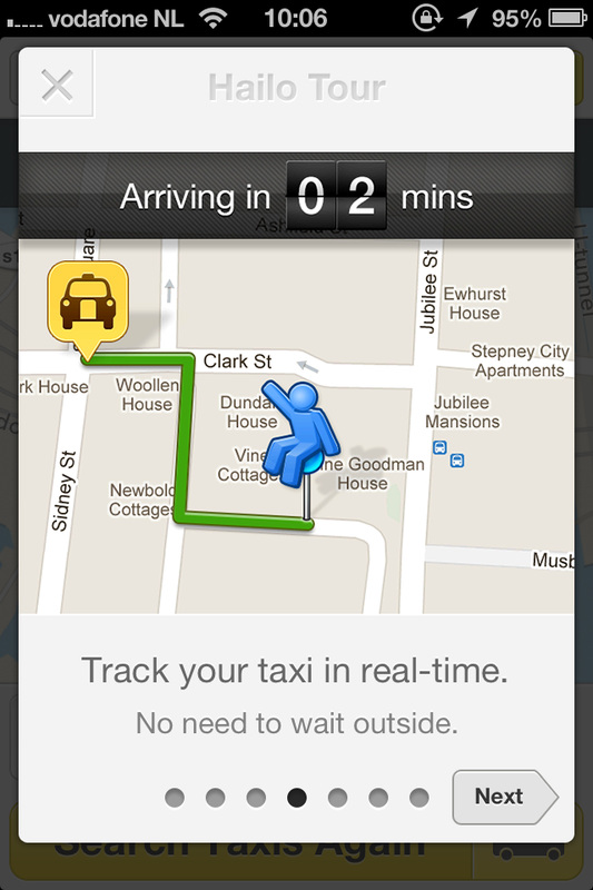
Recently, I searched for two rooms to accommodate a couple and single person in Amsterdam. They were coming to this wonderful city for the weekend. I compared the prices of hotel rooms with apartments on Airbnb. I had hoped that the latter would be cheaper and give my guests a more Amsterdam experience. But no. Despite a survey in the US stating that Airbnb apartments are on average 21% cheaper than hotels rooms, prices were more or less the same. That is unless you prepared to forego the second bedroom and put up with some kind of awkward sofa bed experience in the common area of the Airbnb apartment. This got me thinking about why prices were so similar. Then I thought about what a friend told me. He has an apartment in Amsterdam which lets out via Airbnb on a full time basis. It's being managed, along with many others, by a middle man who arranges for key transfer and cleaning. He levies a hefty 20% commission for his services. My friend admitted that to some extent, he had factored in this commission when setting the rental price of his apartment. Wasn't the whole purpose of Airbnb to allow people to accommodate travellers in their homes for some extra income? Wasn't it all about avoiding the middle man fees in the first place? As Airbnb becomes more and more of a viable business for landlords, it is starting to approximate traditional business models and abide by the laws of supply and demand. At the end of the day, good accommodation will always command a good price.  Generally speaking I've welcomed the advent of iOS 7. One of the things I was unsure about was the process around quitting multiple apps. That is until someone showed me the shortcut. Quitting apps in iOS 7 involves double tapping the Home button and getting to the multitasking screen. Flicking the app preview pane upwards will quit the app. Once it disappears, another pane pops into its place and you can repeat the process. On the face of it, this is much more laborious and error prone than with iOS 6. Fear not however, there is a shortcut in iOS 7 to alleviate the burden of quitting apps quickly. With parallel fingers, you can swipe up on multiple preview panes to get rid of them at the same time. On the iPhone, you can do three at a time. Closing browser tabs on Safari also seemed like a pain on first glance but once you figure out that you can push a window away to the left, closing tabs is much easier. Although this must be done one at a time. Yet another shortcut I was glad to discover on those iOS forums. On another note, I'm not sure how useful the preview pane actually is. The aim is to let you make a more informed decision as to which app to reopen or quit. The thing is, apps in iOS 7 look so much alike that I've reverted to looking at the app icon to differentiate them anyway.  Many of the app preview panes look similar on iOS 7. On a recent visit to Dublin I decided to download the official Dublin Bus app to help me plan my bus journeys around the Irish capital. I'm sad to report that for a city that relies so heavily on the bus service, there are many UX fails with the app. Here's one basic issue that had a real impact on my journey. It relates to how the busses that you can take are set out in the app. They are bundled together in an unorganised, cluttered paragraph. The bus numbers are not in numeric order and appear alongside information about the destination of the bus. This is done without the text styling or punctuation that would allow you to quickly glance and comprehend whether or not the bus rapidly approaching the stop is the one for you. Lumping all this information together made me overlook the 38b bus which was hidden in the middle of the paragraph. The 38b whizzed by me as I stood at the bus stop. A bus that would have brought me within meters of my desired destination. After waiting another 15 minutes in the bitter wind I decided to get a taxi, costing me three times as much. So how could Dublin Bus tackle this most rudimentary case of poor prioritization and legibility of information? A simple solution would have been to have a separate line entry for each bus, to list the buses in numerical order and to embolden the bus number. 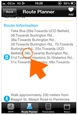 Bus numbers are difficult to read on the Dublin Bus app. The career of many professionals no longer consists of lengthy, closely consecutive periods of time spent at a limited number of organisations. Today people have what I refer to as Tetris careers. Bear with me on this one. Let us imagine the time you spend at a company or at an activity is a Tetris block. The varying shapes and positions of these Tetris blocks is determined by the timing, length and intensity of that commitment. Some shapes lie on top of each other, some alongside, some shapes are difficult to fit in to the rest of the neat rows you might have made, there are gaps. To truthfully map this out would be quite a visual melee as you can see in the illustration below and LinkedIn does a good job at forcing you to simplify things by insisting on a strict chronological format. However, this is an oversimplification in my opinion and does not accommodate those people with more complex or Tetris careers. A career where commitments overlap, where there is important entrepreneurial activity outside of work, where someone takes time off for family, to retrain or to travel. Is this important? I think so. It's not an easy interaction design problem to solve. Suggestions welcome. 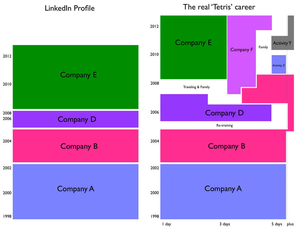 Left: LinkedIn career profile. Right: The real 'Tetris' career. Gone are the days when you can trust the national flag carrier to treat its passengers with integrity and respect. Ireland's Aer Lingus is now employing shady tactics to belie their marketing promises. Today, I received an email from Aer Lingus stating "Guaranteed 25% discount". Feeling that I might like a cheaper fare to the old country, I attempted booking but was flabbergasted by the tiny discount amount offered. Let's look at how Aer Lingus calculated the discount on the outbound leg. 1 Adult = 1 x EUR 66.99, Fare p.p. = EUR 27.99, Taxes & Charges = EUR 46.00, Discount = EUR 7.00. Seven Euro! It turns out that the 25% discount only applies to the "Fare p.p." part. Who else splits their seat prices into Adult and Fare p.p.? Not Lufthansa, not British Airways, not even Ryanair. How arcane and misleading is this unnecessary dissection of a seat price? Shame on you Aer Lingus. 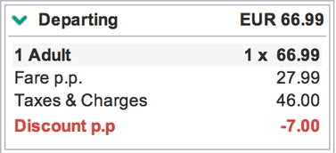 Aer Lingus dissects seat price to confuse users I rented a 2012 Ford Focus for a 600km trip around Ireland last week. Even though its sculpted exterior made it look sleek and swift, its laborious 1.6 litre diesel engine ensured that I didn't get anywhere very fast. It rocked uncomfortably over Ireland's secondary roads and left me pining for rest stops along the way. The biggest problem was the intrusive seat supports. They pressed hard against the outside of my thighs leaving me sore and restless. This is what I don't understand. Why do slow, mainstream cars have unforgiving race-style seats? It is because Ford wants married Joe to feel a bit sportier as he drops his kids to the pool on a Saturday morning? The thing is, everyone knows that Joe is not cool enough or willing to spend the money needed to get him in to something really special. Personally, I'd chose comfort over having to sit awkwardly in an average car that is trying to be a little bit less average. 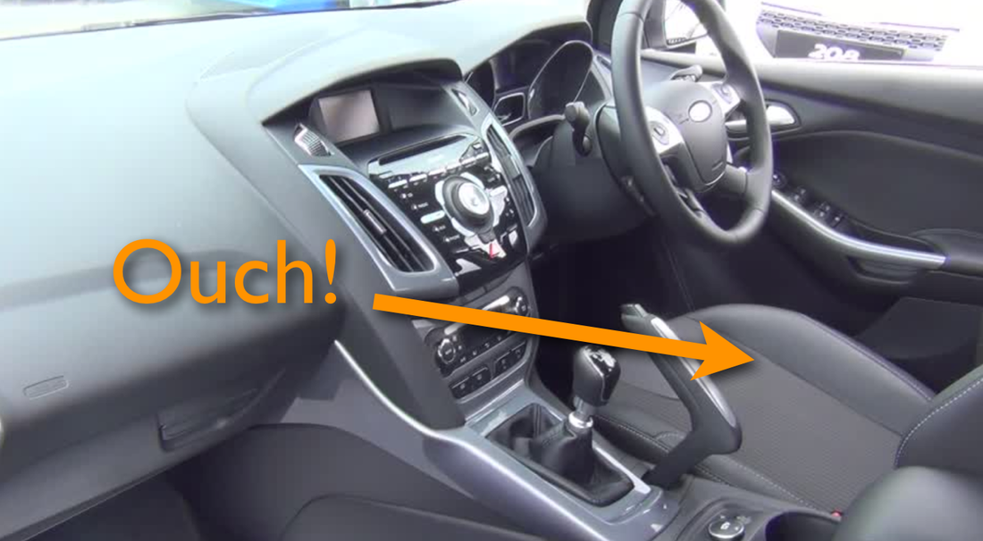 The biggest problem with the 2012 Ford Focus was the intrusive seat supports. Back in 2006 I designed the Navi-Wheel concept for the acclaimed O2 Cocoon. In a time before touch screen, this appealing clamshell device had a 4-way rocker at the top of the keyboard. Pressing on the down rocker in the homescreen allowed the user to access a series of customisable shortcuts. These shortcuts led to frequently used features and settings such as camera and music player. Looking at iOS 7, Control Center does much the same thing. I've written before about how innovative O2 Branded Devices were at the time. We also had plans for Conversation View, where you can see the entire history of the messages sent and received on the one screen. Something that we take for granted today in messaging apps like Whatsapp. Wish we had consulted the patent lawyers at the time :) 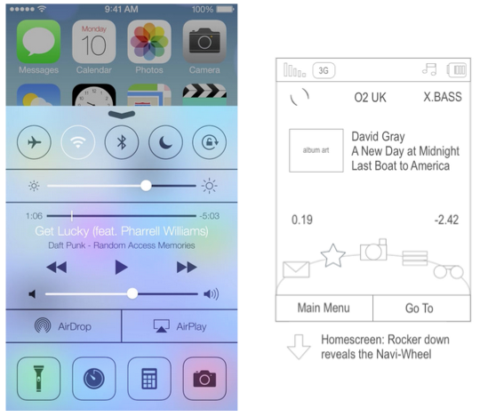 iOs 7 Control Centre (2013) versus O2 Navi-Wheel concept (2006). If your product, website or app is going to be available in multiple languages, you should take translation very seriously. Done well it drives brand engagement and makes customers happier. Done badly and your designs could end up on one of those FAIL websites. Unfortunately, many companies focus solely on the English strings. They also assume that the results of the usual faceless, expensively outsourced translation process will bring back good results. A process where the only thing translators might have to refer to is an Excel spreadsheet containing thousands of strings. Wrrrrong. I’ve seen agency translations that make native speakers laugh with confusion and wince in disgust. My suggestion is to leave translation until as late as possible in the design process. This ensures that the interface will be close to final and that the (English) strings are unlikely to change. Translators must be provided with as much context as possible for each string. There is no substitute to extensive screen shots or providing the actual latest software to the translators so they can truly understand the location and consequence of the strings. For your own peace of mind, find a native speaker and run through the translations on a one-to-one basis. At least for the most important screens or languages. This necessitates investment in time and resources to do this correctly but the results will be worth it. After all, language is a human thing rather than a mechanical process.  User experience has become very accessible. We’ve made it so, that’s the very essence of what we do. In an environment where everyone’s opinion seems to matter, what do you say to a confident and experienced product owner or developer who seems determined to have their way? Resulting in changes that could have an dramatic impact on your designs. I recently attended a talk by a senior marketer. At the beginning he specifically pointed out that that marketing is a science, subliminally raising the bar for anyone else’s point of view on what he was presenting. Whether it is a science with a capital S is another thing. However, it got me thinking about how we used to practice Usability back in the early 2000s. There was lots of science. References to cognitive friction and heuristics were commonplace. Modern day UX is somewhat dumbed down in my opinion and UXers are sometimes guilty of taking shortcuts and not investing proper rigor in to our designs. All this might have backfired. One way to improve design quality and our credibility is to incorporate more method and precision, whilst avoiding jargon of course. Whilst it is good for our output to be accessible to all we should not forget to tell that audience about the principles and ‘science’ used to create it. Thus giving you more reasons to refute the inquisitive product owner or developer. UX might not be science of the rocket variety but it is a science nonetheless.  In 2006 I designed the UX for a number of O2 branded phones. The O2 Ice was intended to be a stylish little number, the thinnest 3G phone on the market. The O2 Jet was a no nonsense business phone with incredible battery life, banishing superfluous functionality like the energy hungry camera. Low and behold, seven years later Nokia release the 206 and 105 that respectively channel the spirit of O2’s vision. The form factor, concept and feature set are strikingly similar. It’s nice to think we were ahead of our time (applause). Er, not quite. Although our hardware was more streamlined, the reality is that we were probably influenced by the simplicity of Nokia’s ubiquitous early designs such as the 1112 and the legendary 6310. You could say that these new low budget phones represent a return first principles for the Finnish manufacturer. 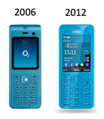 Left: The O2 Ice. Right: The Nokia 206. When someone downloads your application, should you provide a guided tour upon first time use? Some would say that by doing so, you’ve obviously not made your product intuitive enough in the first place. Bad UX, bad. On the other hand, I believe that a guided tour, done well, is more akin to the welcome you might receive at a fancy hotel. Ideally your guests will be excited about being there and are willing to hear more about the highlights of the experience that lies ahead of them. Here are some tips on how to provide a good guided tour.
Finally, a website that understands how people use search results. If you’re like me you will have spent hours pouring over search results for important purchases. You might do this over the course of days or weeks, returning to those same results as you narrow down your choice. This is especially the case when it comes to decisions such as buying a house or choosing a hotel. You will also know how annoying it is to see properties that you’ve previously discounted for one reason of another. Enter booking.com where you can now remove items from your search results. Admittedly, the way in which booking.com has chosen to implement this feature is a little rough around the edges. The control is a transparent ‘no entry’ icon that sits a top the image of the property, only revealing its function upon hover over. Initially it looked like to me that there was a problem with the image or that the property was unavailable. It might have worked better as a simple ‘x’ icon accompanied by a short label underneath the image. It's also a little difficult to see where these deleted properties go and how to recover them. This feature is on the left hand side navigation. Well done booking.com nevertheless. 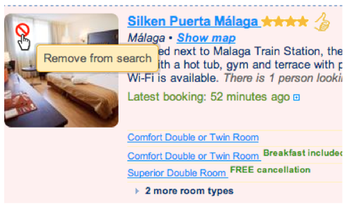 Booking.com's excellent 'remove from search' functionality |
WelcomeI'm Frank Gaine. Strategist, Designer, Manager, Founder, Educator. 
Archives
April 2022
|
 RSS Feed
