|
So you want to change your app icon. Well you'd better think carefully about it or risk conversion and customer satisfaction. Let's look at an example. Tunein Radio is one of my fav apps. Recently they changed their app icon. However, not only did they change the colour of the icon they also changed the content or motif. The icon had been a distinctive block of dark blue which incorporated a radio metaphor and an accompanying smile. The updated icon changed the predominant colour to an ignorable grey as well as integrating a new motif. A motif which is as unintelligible as the London 2012 Olympics logo. Since the change I've struggled to find the Tunein Radio app in the sea of other icons on my phone's home screen. I've used it less and less, if at all. One less user for tunein radio then. 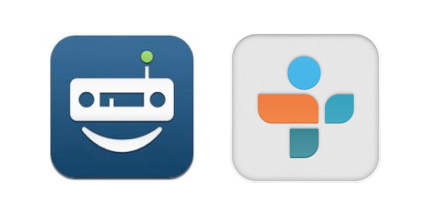 Tunein Radio icon: Old (left) and new (right) The impact of an unthinking change of app icon are manyfold. The obvious one is that the user will have difficulty in finding the app. The worst case scenario is that the user chooses a competing app because they can locate and comprehend the competitor's icon. The user gets acclimatised to using that app, buying through it and does not return to your app. Another impact is the prospect of upsetting your already satisfied customer.
If you have to change your app you would be well advised to take a softly softly approach. Don't change the predominant colours and the motif of the icon at the same time. Change the colour first and then sometime after change the motif. Or visa versa. Allow people get used to the change. Take Fancy for example. Recently their app icon changed from grey to blue without changing the readily identifiable popsicle motif of the icon. The move away from grey can only be a positive step for its presence and visibility. Having said all of the above, maybe getting your icon design right in the first instance might be the best course of action.
1 Comment
Footnote: Such was the change to their icon that Hotels.com deemed it necessary to state the following to describe their app on the Apple App Store; "Do you like our new look? We are still the same Hotels.com you know and trust, we have just had a little makeover with our app icon". Leave a Reply. |
WelcomeI'm Frank Gaine. Strategist, Designer, Manager, Founder, Educator. 
Archives
April 2022
|
 RSS Feed
