|
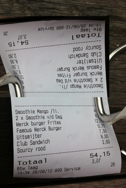
I had lunch today with a table of my favourite people. Being Amsterdam we decided to go Dutch, split the bill. We placed the bill on the table but people kept turning it around to see what they owed. So how about a bill that shows the amount in both orientations. OK, I admit that it would be an unusual, somewhat confusing concept to get used to and that it’d consume more paper and ink but think of the convenience, OMG the convenience. Check out my terrible photoshopped image of such an incredible incarnation.
0 Comments
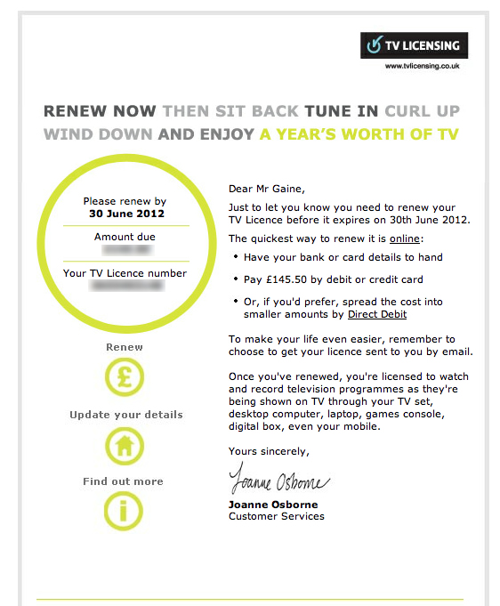
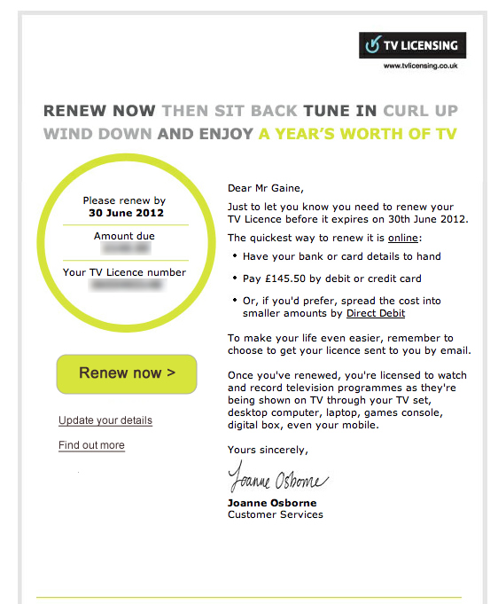
I know Karl for awhile. Recently he came along to my birthday celebrations and we realised we were not friends on Facebook. Shock horror. Karl's surname is difficult to spell so he helped me find him on Facebook on my phone. As we were looking at the screen together I pressed the 'Add friend' button. Immediately afterwards a dialogue popped up asking me to categorise Karl as a acquaintance or close friend. Awkward. Selecting close friend would not have felt right for both of us as we are in the process of getting to know each other and hanging out more. Whereas the word 'acquaintance' suggests that the relationship is somewhat nonchalant or 'slight' as Google would have it. The gap between acquaintance and close friend is too wide. Facebook's intention is to let you see less of an acquaintance's activity in your news feed. But why ask to classify that person there and then? Surely you will only want to make this decision when you see the nature of what they post. Their posts might mean that you get to like that person more and become close friends. Facebook would do well to simply let me add a friend and categorise them if I want to sometime later. 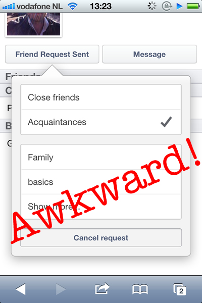 Adding a friend on Facebook mobile can be awkward. I’m one of those annoying people who think the UK TV license fee is worth every penny. Conveniently, the TV Licensing people sent me an email entitled ‘You've 14 days left to renew your TV Licence’. I opened the email, pondered over the fee amount for a while then decided to pay online. Where was the ‘pay now’ button? After some time I noticed a pound (£) icon with the word ‘renew’ written in tiny text above it. The icon did not look interactive because it was in the same circular style as the area housing the fee amount and my account number. There was also no prioritization of the icon. It was the same size as periphery options such as updating personal details and finding out more info. Surely the main aim of an email such as this is to get someone to pay as soon as possible and to do so in a polite manner (given that the TV license fee is a controversial issue). Anyway I’ve quickly mocked up how the email might work better by having a clearer 'renew' call to action. Did I succeed?
LEFT: Original TV Licensing email. RIGHT: Emphasizing the 'renew now' button
There are a number of on-demand car programmes in Amsterdam. You can pick up a car from an assigned parking slot and pay by the minute or kilometre. Some of these schemes are more obvious than others. Car2Go runs a fleet of blue and white electric Smart cars. I've seen them hooked up to dedicated charging points by luminous umbilical chords. An obvious livery and unusual car makes them stand out. However, I was only made aware of Green Wheels when my friend pointed them out. Ironic when they are literally on every street in the city. Why did I not notice them? The answer lies in the cars colour scheme and the marque used. Little red Peugeots are everywhere in Europe and Green Wheel's decals have done little to distinguish them from these other cars. My advice for Green Wheels, paint the doors a contrasting colour and quadruple the size of your logo. Simple. 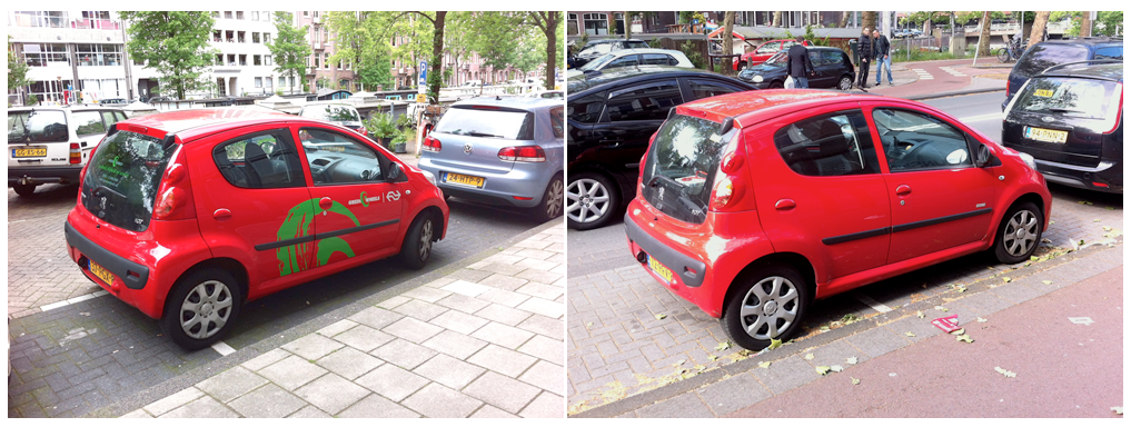 Green Wheels Peugeot 107 (left) and standard Peugeot 107 (right). So you want to change your app icon. Well you'd better think carefully about it or risk conversion and customer satisfaction. Let's look at an example. Tunein Radio is one of my fav apps. Recently they changed their app icon. However, not only did they change the colour of the icon they also changed the content or motif. The icon had been a distinctive block of dark blue which incorporated a radio metaphor and an accompanying smile. The updated icon changed the predominant colour to an ignorable grey as well as integrating a new motif. A motif which is as unintelligible as the London 2012 Olympics logo. Since the change I've struggled to find the Tunein Radio app in the sea of other icons on my phone's home screen. I've used it less and less, if at all. One less user for tunein radio then. 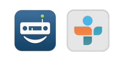 Tunein Radio icon: Old (left) and new (right) The impact of an unthinking change of app icon are manyfold. The obvious one is that the user will have difficulty in finding the app. The worst case scenario is that the user chooses a competing app because they can locate and comprehend the competitor's icon. The user gets acclimatised to using that app, buying through it and does not return to your app. Another impact is the prospect of upsetting your already satisfied customer.
If you have to change your app you would be well advised to take a softly softly approach. Don't change the predominant colours and the motif of the icon at the same time. Change the colour first and then sometime after change the motif. Or visa versa. Allow people get used to the change. Take Fancy for example. Recently their app icon changed from grey to blue without changing the readily identifiable popsicle motif of the icon. The move away from grey can only be a positive step for its presence and visibility. Having said all of the above, maybe getting your icon design right in the first instance might be the best course of action. |
WelcomeI'm Frank Gaine. Strategist, Designer, Manager, Founder, Educator. 
Archives
April 2022
|
 RSS Feed
