|
On a recent visit to Dublin I decided to download the official Dublin Bus app to help me plan my bus journeys around the Irish capital. I'm sad to report that for a city that relies so heavily on the bus service, there are many UX fails with the app. Here's one basic issue that had a real impact on my journey. It relates to how the busses that you can take are set out in the app. They are bundled together in an unorganised, cluttered paragraph. The bus numbers are not in numeric order and appear alongside information about the destination of the bus. This is done without the text styling or punctuation that would allow you to quickly glance and comprehend whether or not the bus rapidly approaching the stop is the one for you. Lumping all this information together made me overlook the 38b bus which was hidden in the middle of the paragraph. The 38b whizzed by me as I stood at the bus stop. A bus that would have brought me within meters of my desired destination. After waiting another 15 minutes in the bitter wind I decided to get a taxi, costing me three times as much. So how could Dublin Bus tackle this most rudimentary case of poor prioritization and legibility of information? A simple solution would have been to have a separate line entry for each bus, to list the buses in numerical order and to embolden the bus number. 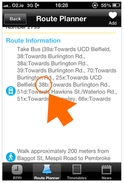 Bus numbers are difficult to read on the Dublin Bus app.
3 Comments
ivor and damo
17/9/2013 07:55:44
get yourself a caaar bud!
Santry16A
24/9/2013 13:30:37
Same thing happened to me last week. It looks like they've just sucked the list of busses from the web without making any attempt to format it. Basic errors!
Eamonn
20/10/2013 05:13:55
It's a terrible app. The route planner insists that you type in the bus stop number or address. All I want is a map to show me where I am so I can select the stop near me!!! Plus it does not give you total journey times. Prehistoric. Leave a Reply. |
WelcomeI'm Frank Gaine. Strategist, Designer, Manager, Founder, Educator. 
Archives
April 2022
|
 RSS Feed
