|
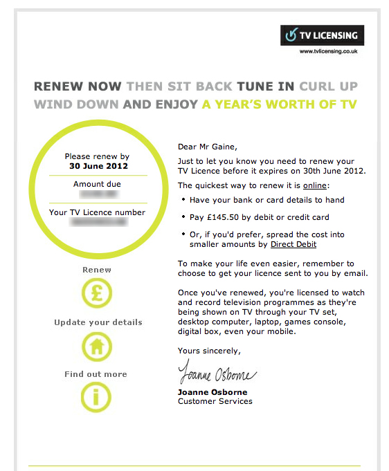
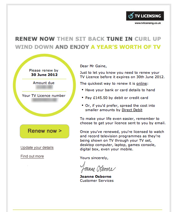
I’m one of those annoying people who think the UK TV license fee is worth every penny. Conveniently, the TV Licensing people sent me an email entitled ‘You've 14 days left to renew your TV Licence’. I opened the email, pondered over the fee amount for a while then decided to pay online. Where was the ‘pay now’ button? After some time I noticed a pound (£) icon with the word ‘renew’ written in tiny text above it. The icon did not look interactive because it was in the same circular style as the area housing the fee amount and my account number. There was also no prioritization of the icon. It was the same size as periphery options such as updating personal details and finding out more info. Surely the main aim of an email such as this is to get someone to pay as soon as possible and to do so in a polite manner (given that the TV license fee is a controversial issue). Anyway I’ve quickly mocked up how the email might work better by having a clearer 'renew' call to action. Did I succeed?
LEFT: Original TV Licensing email. RIGHT: Emphasizing the 'renew now' button
1 Comment
David
16/9/2015 13:35:23
I also suggested to them that they might like to soften the wording of the subject line from "You've 14 days left to renew your TV Licence" to something like "Your TV Licence is coming up for renewal in 14 days", making it rather less accusatory that I might have ignored a non-existent previous more polite communication. Leave a Reply. |
WelcomeI'm Frank Gaine. Strategist, Designer, Manager, Founder, Educator. 
Archives
April 2022
|
 RSS Feed
