|
Recently Google Chrome overtook Internet Explorer as the world’s most used internet browser. Among its killer features is the automatic translation it applies to sites in other languages. Translation works more or less seamlessly and has been a life-saver for this ex pat. However, when you hover over a translated word, Chrome insists on showing the original word in a large white popup nearby. To date I’ve not found a way to disable this. I’ve tried closing the popup but it appears again and again. Most annoyingly however, this popup often appears in front of the link you wish to click on. Thus completely preventing you from clicking on that link (unless you are lightening quick with your mouse). Looks like one of those no brainer changes they should make as quickly as possible. 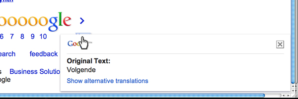 Link obscured by the translation popup in Google Chrome
3 Comments
I still have the core principles of usability burned into the back of my eye lids. Among them was the important concept of avoiding ‘premature commitment’. That is, show the visitor to your site the value of signing up before asking them to sign up. Despite a nicely branded site and a wonderful concept (renting directly from owners in the Netherlands and avoiding exorbitant estate agent fees) I think the guys over at Monster Rent missed the memo on this. Instead of clicking on a property and being given more tantalizing images and details, the user is asked to sign up for an account costing 4.95 euro per month. Only 4.95 I hear you cry, surely good value if you are to avoid those pesky fees? If they had more than 23 properties available then I would have agreed. Showing more detail will help secure more sign ups, more interest from landlords, more apartments advertised, more lettings and ultimately more revenue. Instead, I simply left Monster Rent's site and spent more time writing this blog entry. 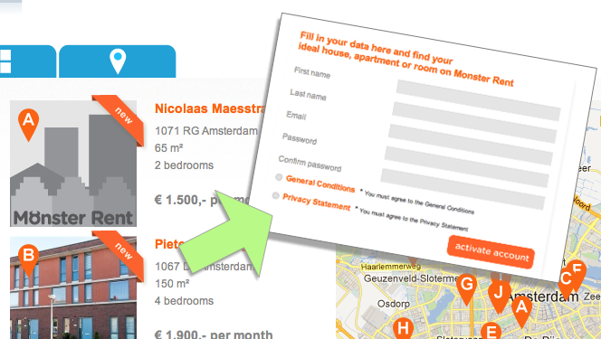 Monster Rent asks for sign up prematurely On a recent trip to the Bulgarian capital Sofia, I used the city's metro system. One lev bought me passage into the city centre. The ticket was narrow and light, made from flimsy paper. Entry through the gate is achieved by scanning the small bar code at the top of the ticket. This is not easy as you need to insert half of the ticket into the waist-height reader while maintaining it in your hand. I hit the casing around the reader a couple of times trying to pinpoint the reader. I can understand the frustration of fellow passengers behind me as I struggled slightly. Finally I did it. The light turned from red to green and I was expected to proceed and push through the bar in front of me. A tribute to the colours of the Bulgarian flag maybe but passengers with red green colour blindness might be even further delayed by the use of this convention. Although necessary for the vast numbers of people it has to move, London's underground is much more efficient in term of entering the system. A larger more robust ticket is sucked up by the machine and is presented back to the user slightly further along the now-opened gate, encouraging them to move forward. That said much preferred the spacious stations and carriages of Sofia's burgeoning metro system. The city itself is also filled with interesting history and beautiful buildings. 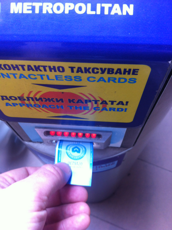 Difficulty pinpointing the bar code reader on the Sofia Metro If you connect with me on Linkedin what happens next? In my experience not that much unless you are a recruitment agent. So what if Linkedin is in danger of becoming a glorified recruitment website. There’s plenty of revenue to be had in direct recruitment. However, in my opinion the connections made on Linkedin are too shallow to keep me from seriously considering similar peer networks or other services. If I owned Linkedin I’d use the organization’s undoubted credibility to forge deeper connections between people and empower professionals both young and old. I would encourage mentoring, expertise exchange and self-publication. Imagine how useful it would be for a junior professional to ask a more senior mentor about their next career move. Imagine the breath of the audience available for someone’s research paper through Linkedin. Imagine if it offered approved training courses that were peer driven or commercially derived. The question remains, how long will that $100 share price last without imagination. 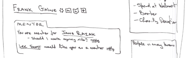 Pencil sketch of the 'mentor' module in my Linkedin concept 1. Flipboard Simply addictive. Flipboard is the epitome of usefulness, usability and engagement. It presents perfect bite size chunks of information in your chosen topics, most accompanied by a carefully rendered image. Combine this with a novel and wholly intuitive way of flipping through content and the result is my number one fav app. FREE 2. TuneIn Radio Numero dos is TuneIn Radio. Listen to virtually any radio station the world over. Awesome when you are feeling a little homesick or if you are someone with unusual interests like my friend who listens to Memphis police radio. Personally 247 Comedy Radio is the best thing I've found so far. FREE 3. ABN AMRO Dutch bank ABN AMRO has made an appealing and visually polished app. Their practical approach to logging in guarantees more frequent use. Set a six digit pin on the app and you can see your statement straight away. Transactions need the parallel use of the card reader but that's understandable for security reasons. FREE 4. Splice Splice has been on my phone for almost a year now and regularly survives periodical app clean up operations where I delete those whimsical and rarely used installations. Splice is my app of choice for making simple movies with its smart transitions and easy options to overlay voice or other audio on the video. $3.99 5. Action Movie Pure fun now. Action Movie was originally launched to accompany the Mission Impossible Ghost Protocol movie. It adds sophisticated special effects over any scene you care to video. Effects include a realistic tornado, tear gas attack, car crash and gunfire. I've bought every additional effect they've made available, unusual for someone who is sceptical of in-app upgrades. FREE 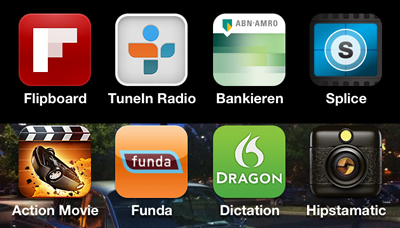 My Top 5 Apps Remember when one of the key recommendations for website design was to avoid lengthy pages? Well how things have changed. Have you seen Beetle.com? In my opinion it’s gone to the other extreme and is a veritable recipe for RSI. Plus it took ages to load. To get to the bottom of the page it took twenty scrolling movements on my mouse. Ouch. Engaging and novel as it is, I was more focused on careful vertical scrolling rather than interacting with anything on the page which would have required some horizontal movement on my behalf. I presume that swiping at the page on the iPad would be less taxing but still a lot of work. That’s not to say that I disagree with providing longer pages that reveal their content in a more dynamic fashion as you scroll. In fact I like it. Citroen, Nike, Rory McIlroy and Italian bag designer Bagigia have less ambitious but arguably more palatable renditions of this feature. Thinking about it, one thing these sites have forgotten about that could be quite apt to this style of presentation is audio. Now how would that work, thoughts? Also have a look at New Zealand and No Leath women’s shoes. Related story: The Extinction of the Scrollbar  Extreme scrolling at Beetle.com This Easter I was lucky enough to escape to France with a car full of friends. The car hire company presented me with a surprisingly delightful Opel Insignia. I've rarely felt as safe and comfortable in a car. Nice one GM. On our return the weather turned for the worst. Rain, wind, poor visibility ... the works. Coupled with a packed motorway and talkative companions, there was a lot to contend with for me as the driver. At one point I wanted to change the music track being played. Keeping my eyes on the road I fumbled about trying to find the skip-track button with my free hand. After a few moments I managed to change the track but didn't realise that I has also turned off the traction control. Although the car does tell you that this has taken place, the distraction in and around the car meant that it took me a long time to realise what had happened. So what's the point? I guess it'd be better if GM kept controls critical to the safety of the car away from more frequently used button to prevent errors like I've just described. Still, nice car and great holiday. 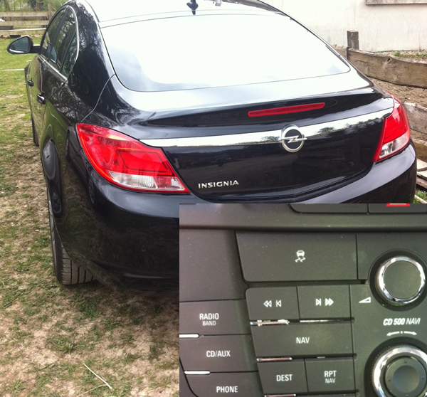 Traction Control button is tool close to the track control button. Looking for flights from Amsterdam to Denver this week, I happened across a very nice design feature on KLM’s mobile website. When choosing your dates for travel, the calendar flips down from the departure/return date controls. Flipboard eat your heart out why don’t you. The trip-type and class-selector also use very attractive iPhone-esque toggles. Not so amazing is the fact that the country selector is hidden below the fold on the homepage and defaults to the USA. This meant that I was scrolling through a list of US airports before I realized that I had to somehow go and change my country of origin. This control only exists on the homepage so returning there, finding and changing it is a tad annoying I must say. This was an issue I was keen to avoid in the design of the Yamaha mobile website recently. Still, the fresh mobile-tailored design is enough for me to be happy to use KLM’s website on my iPhone.  Shows the calendar in the process of flipping down from the departure date control. To my family, Skype IS talking over the internet, sorry Apple. We all have Apple products yet we still use Skype and not FaceTime. Maybe its because we started using Skype with Windows products and old habits die hard. Anyhoo, despite Skype’s popularity it seems they are still making applications with fuzzy navigation. Version 3.5.454 of the Skype app for iPhone has one particularly annoying issue. When you try calling an online contact and the call is ended because they do not pick up, you end the call or something else happens you are brought to the messaging menu for that contact (see below). I can possibly see Skype's point of view here; if you can’t call them, message them. However, the reality was that I spent a long time wondering how I ended up on the messaging screen when the last thing I saw before putting the phone to my ear was my family member’s contact details with options to make a video call, chat or send an sms. When a call fails in this way the most likely thing I want to do is to try calling them again. When an error happens it's best to return users to where they were before the error occurred and explain the issue and recommended actions from there. You with me? 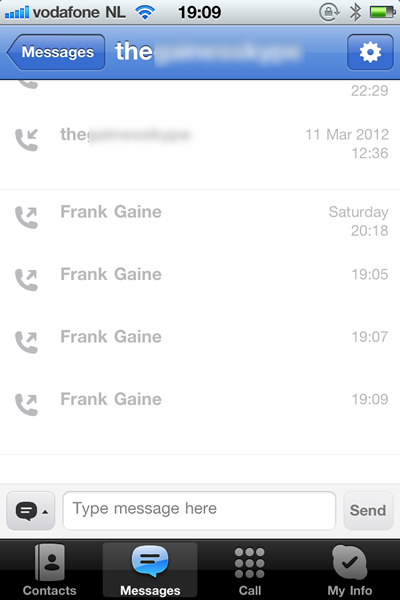 Shows the message screen that appears if a call fails. Below is the remote control for my new Philips TV. Let's get straight to it. I never know which way is up, I can never find the mute button quick enough, it keeps slipping off the couch, I can't see it in a darkened room, it feels too light and cheap. Need I continue? Might be worth comparing the Sky remote control. With this classic piece of ergonomic engineering you always know the back from the front, top from the bottom. Sounds basic but we've seen how it can go wrong. The Sky remote has a rubberised back which sticks nicely to leather or whatever the couches of meer mortals are made of. The layout and shape of the keys make it a doddle to use in the dark. Plus it feels like a quality product, weighty but not heavy, colourful but not gaudy. Interestingly the Sky Remote made it into the Design Museum in London in 2009, along with the O2 Cocoon for which I designed the user interface. Check me out! 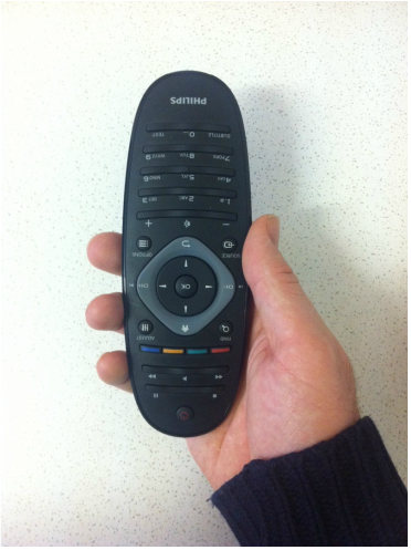 Philips remote control, the wrong way round. As some of you might know, I'm the guy behined App in Seconds. Here's the latest blog from there ... Last week we spoke about the different uses of App in Seconds. Yet another alternative and quirky use for the service has emerged. Tom, a friend of App in Seconds pointed out that he had used it to play a cunning pranks on a friend. Sounds interesting, want to hear the story? Read more at appinseconds.com/blog
So I've finally updated my portfolio website. Well, it's the one I've had all along but initially I thought that I needed to find a more bespoke portfolio experience for my site visitors. I searched for 'UX portfolios', 'create portfolio' and so forth. Results returned the regular off-the-shelf portfolio websites such as Krop, Coroflot, Behance, Cargo Collective and Carbonmade. All of which seemed to be targeted more at photographers, graphic designers, print designers and other such like. They either looked too generic, too restrictive or lacked basic usability. Some were ridiculously expensive. Is there a gap in the market for a UX-specific portfolio service? Maybe but in the meantime you'll have to put up with me shoe-horning screenshots of my previous work into the templates of my current drag-and-drop website provider. Enjoy!
So I've decided to bring all my blogging and writing together on this website ... finally.
|
WelcomeI'm Frank Gaine. Strategist, Designer, Manager, Founder, Educator. 
Archives
April 2022
|
 RSS Feed
