Overuse of lines, borders and shadows distracts instead of focussing users. Look at Facebook mobile21/9/2012 Yesterday I realized that my news feed on Facebook mobile was taking me a long time to digest. I needed to focus really hard to extract important information like people’s status updates and distinguish them from pages they liked or other activity. I realised that I had seen this issue before at Vodafone Group a few years ago. The Facebook news feed was suffering from something I like to call over-delineation. There are simply too many line dividers, shadow effects and borders on the page. Instead of helping us to divide and separate information, the use of so much delineation simply gives our eyes too much to process and makes it difficult to identify what is of value and what is not. The solution is to trust in the use of space, indentation and text emphasis to do the job. 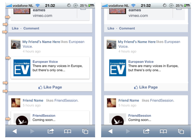 Left: Current Facebook newsfeed. Right: Facebook newsfeed with many of the dividers, shadow effects and borders removed. More scannable I'd say.
1 Comment
So I had an idea. I thought it was gonna make me a millionaire. I drew prototypes of it on paper. I showed it to people who make their money in that industry. Unfortunately, it didn’t go down at all well. The idea was a simple calendar where recruiters can see the guaranteed-up-to-date availability of freelancers for weeks in advance. It turns out that most recruiters don't want to talk to freelancers that are available. More are focusing on headhunting, getting the best candidates to leave their current engagement for something more lucrative or more interesting. The perception is that if you’re available you can’t be that good. Fair enough but that gave me another idea. How about a service where you can only book a freelancer at the last minute? Even the best freelancers can have immediate availability should a project they are working on be cancelled for example. In any event, recruiters would have to be realistic about the perceived abilities of that freelancer given the tight deadlines of get someone sitting at a desk. I’m now gonna go away and prototype that idea, I’ll let you know how I get on. 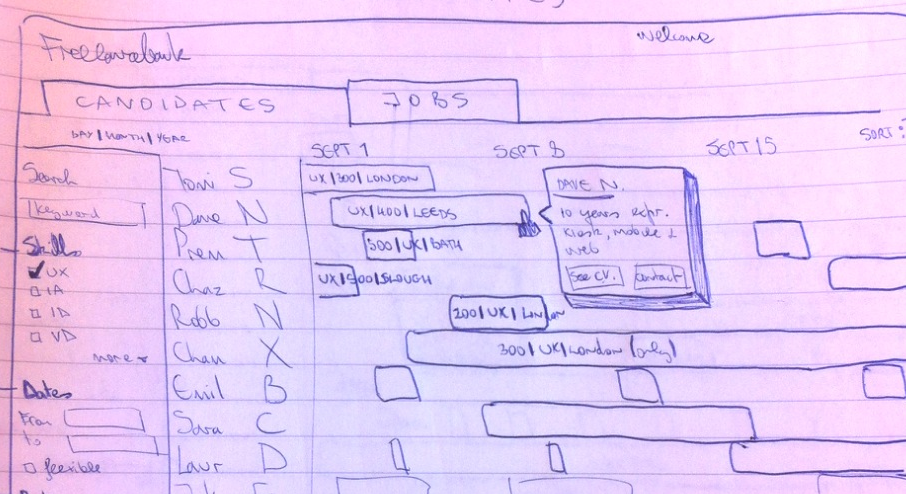 Paper Prototype. Calendar showing the guaranteed-up-to-date availability of freelancers. One word, Ryanair. The no-frills airline from the Emerald Isle has seen record profits this year despite defying that most sacred of UX matras. That is, great user experiences are Useful, Usable and Engaging. But thinking about it in more detail and I am reassured. Although Ryanair is a successful business it is not a successful user experience. In fact it is the most complained about airline in the world. “To hell with user experience” is possibly what Michael O’Leary, Ryanair’s outspoken CEO, might respond. After all, in the past he has acknowledged and also refused to apologise for the airline’s lack of customer service. The reality is however that Ryanair’s arrogance is bearable as long as they are able to offer destinations and prices that other airlines find difficult to compete with. Given a more even playing field things might be very different. The problem for Ryanair is that passengers might not forget their sneaky ways so quickly.  Michael O'Leary, Ryanair CEO |
WelcomeI'm Frank Gaine. Strategist, Designer, Manager, Founder, Educator. 
Archives
April 2022
|
 RSS Feed
