|
I was hungry and didn't want to leave the house. So I downloaded the much advertised Thuisbezorgd.nl app (takeaway.com in other countries). Searching through the unfamiliar local restaurants I couldn't help thinking that I'd like to have seen photos of the restaurant premises, inside and out. Visions of dirty kitchens shoveling out cardboard fare ran through my mind. Thuisbezorgd.nl would do well to offer some reassurance in this regard. The rating system is almost defunct as most restaurants seem to have a 4 star rating. Therefore, I chose a local restaurant that I had walked by previously and looked ok. Anyhoo, I ordered by credit card. They said that I'd be given updates by SMS. Then I waited. And waited. No SMS. I looked at my app to see the status of my order. Low and behold, there is no My Orders option in the app. I resorted to ringing the restaurant directly. They never got the order. Something went wrong somewhere. Net result, no pizza and I was still hungry. The bottom line is that Thuisbezorgd.nl should have an in-app order tracking option showing the order status: order received, in the oven, on the way etc. With options to cancel or increase the order if time allows. They should also be more proactive, following up on cases where delivery is waaaaay outside the normal delivery times. I did get a €7.50 voucher but am very hesitant to order again. Maybe I should not be as lazy and walk to a restaurant next time. 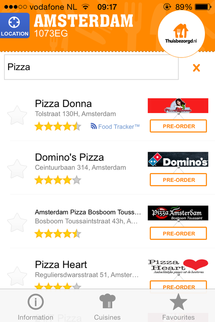
1 Comment
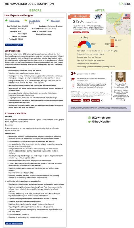
Text, text and more text That just about summarises most people’s experience of job descriptions. Bereft of even basic enhancements such as hyperlinks, text formatting and images. Far from allowing you to get a quick grasp of the role or remotely enticing you to apply, most job descriptions are all the same, bland and generally uninspiring. It takes more to impress a UXer UXers are particularly sensitive to the design of every day things such as job descriptions. So, what if we could humanise the job description in such a way that the remit, responsibilities and remuneration were easy to grasp and candidates were left longing to apply? Before and After We took a random job description for a UX Designer and applied the UXswitch magic to it. Making it more usable and human as we went. This meant thinking about the most important information and highlighting that in the design. We added some critical pieces of information that should have been there in the first place (such as salary) and replaced swathes of copy with images and text emphasis. We think the new design allows employers to stand out from the crowd and attract the attention of the UXers they are trying to find. Let us know what do you think. What did we miss? See humanised job descriptions we have created for Booking.com and Pokerstars.com. This will be easy to do UXswitch is working on a simple online form that contains all the fields that employers/recruiters need to fill out in order to provide the appropriate information for the humanised job description. Select a template. Enter text, upload images and insert links. Hit Submit and hey presto! A beautiful, responsive and engaging job description is created. Watch UXers queue up to join your team. UXswitch makes you look good Once you hit Submit, UXswitch will immediately provide you with a number of UXers from our members that fit your requirements exactly. UXers will also receive notifications of perfect job matches. You’ll get a dashboard allowing you to quickly compare these and any other UXer that applies. Share your tops pick with your client or integrate these candidates into your own database with ease. UXswitch makes life easier! Key features
 Humanising the job description |
WelcomeI'm Frank Gaine. Strategist, Designer, Manager, Founder, Educator. 
Archives
April 2022
|
 RSS Feed
