|
There's a great app from booking.com. It's called Tonight where you can book a room for that very night. Not for tomorrow night or for two weeks time, only for tonight. I've used it for last minute deals and saved heaps of cash. However it still puzzles me that hotels listed on the app offer a discounted non-refundable rate and also a normal rate. The normal rate is higher and allows you to cancel two or three days in advance without a penalty. Hello, users of Tonight are likely to be booking less than twenty four hours in advance. The cancellation policy could never apply so why offer it? Anyway my advice is to choose the no refundable rate and save yourself some dosh. 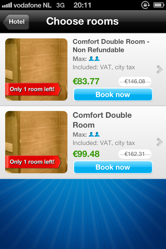 Why pay $16 more on same day hotel bookings?
48 Comments
Ten years ago I wrote guidelines on how to design interactive voice response interfaces like voicemail and cinema listings. It pains me to find systems today that are as frustrating and difficult to use as they were back then. Take UK bank Lloyds TSB for example. I called them from abroad and spent 56 seconds spitting out my account number, sort code and date of birth before they told me that their service was closed for the day. Arghh. Just tell me the office is closed up front.
The UK phone network called 3 insists on reading out the telephone number of a caller before you listen to the message. Infuriating when someone from the Ireland calls only for them to decide not to leave a message in then end. Meanwhile I had to sit through an unnatural and slow automated voice read out the following 'Message from zero zero three five three eight seven X X X X X X'. Arghh again. Just play the message and let me determine if I need the number read out to me afterwards. I sometimes browse the App Store’s Top 25 or Featured lists, just to see if anything catches my fancy. Unless I’ve already heard good things about an app, the decision to enter the detailed description page is a combination of five factors. The app icon, app name, app publisher, rating and price. All too often apps limit their appeal by not addressing these factors effectively. Take Vyclone for example. It’s difficult to imagine what this app might entail when you look at its fabricated name and ambiguous icon. On the same list we have Captain Antartica. Its icon has a rocket propelled cartoon bird flying through the air and it is published by FDG Entertainment. You simply know it’s a game and can even imagine the kind of gameplay. Vyclone, in case you are interested, allows you to synchronise video taken by multiple people and mash them into one continuous video. Neat. However, Vyclone should have included some nuance of video in their icon and app name. Instead millions will see it in the list of featured apps and never dig any deeper. 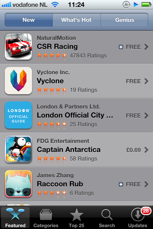 Can you guess what Vyclone is all about? Yes Facebook mobile is hiding something. It hides enough of an image in your news feed for you to miss the point of the image or to puzzle your friend's judgement for posting it there. The top and bottom of any given image is cropped. You can only see the full version by touching the image and going to a new page. How good would it be to be able to scroll the image in its placeholder so you can see the entire version? Difficult to do when scrolling is required to control the whole page but I'm sure some mechanism could be designed to do so. Any ideas?
Press up if you wanna go up, right? Not so fast hombre. In my friend's building you press the down arrow to call the life DOWN to the ground floor. On the top floor you press the up arrow to call the life UP to the top floor. Even though there is only one button to press in both cases it's still worthy of a blog piece in my opinion. Who said UXers need to get a life? 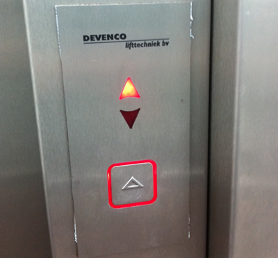 On the top floor there is one button which points upwards. Hardly intuitive. I want to go DOWN. Banner ads on YouTube are not so irritating anymore. However, having to sit through in-stream video ads before seeing the main content is infuriating. Some adverts allow you skip to the content after five seconds. I watch these until that option arises. The ones that do not have a skip option immediately make me choose another source for the video I want to watch. I do this knowing that Google only receives revenue if all or at least 30 seconds of the in-stream ad is observed. Many advertisers don’t realize that the first five seconds is where they should concentrate the brand, product shot and key message. It's a big challenge but do it right and it could represent free advertising. There are so many examples of doing it wrong, see below. Advertisers and agencies mistakenly think we will be as enamored with their ideas as they are and will watch the ad until the end. Ultimately, the pragmatism and understanding of customer behavior that UX brings could make advertising more effective. |
WelcomeI'm Frank Gaine. Strategist, Designer, Manager, Founder, Educator. 
Archives
April 2022
|

 RSS Feed
