|
If you connect with me on Linkedin what happens next? In my experience not that much unless you are a recruitment agent. So what if Linkedin is in danger of becoming a glorified recruitment website. There’s plenty of revenue to be had in direct recruitment. However, in my opinion the connections made on Linkedin are too shallow to keep me from seriously considering similar peer networks or other services. If I owned Linkedin I’d use the organization’s undoubted credibility to forge deeper connections between people and empower professionals both young and old. I would encourage mentoring, expertise exchange and self-publication. Imagine how useful it would be for a junior professional to ask a more senior mentor about their next career move. Imagine the breath of the audience available for someone’s research paper through Linkedin. Imagine if it offered approved training courses that were peer driven or commercially derived. The question remains, how long will that $100 share price last without imagination. 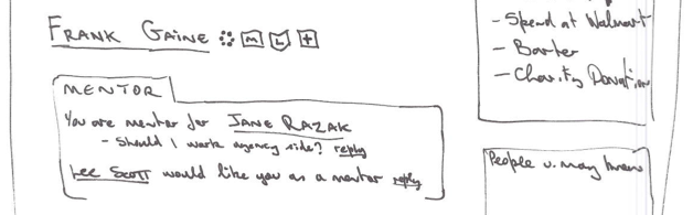 Pencil sketch of the 'mentor' module in my Linkedin concept
30 Comments
1. Flipboard Simply addictive. Flipboard is the epitome of usefulness, usability and engagement. It presents perfect bite size chunks of information in your chosen topics, most accompanied by a carefully rendered image. Combine this with a novel and wholly intuitive way of flipping through content and the result is my number one fav app. FREE 2. TuneIn Radio Numero dos is TuneIn Radio. Listen to virtually any radio station the world over. Awesome when you are feeling a little homesick or if you are someone with unusual interests like my friend who listens to Memphis police radio. Personally 247 Comedy Radio is the best thing I've found so far. FREE 3. ABN AMRO Dutch bank ABN AMRO has made an appealing and visually polished app. Their practical approach to logging in guarantees more frequent use. Set a six digit pin on the app and you can see your statement straight away. Transactions need the parallel use of the card reader but that's understandable for security reasons. FREE 4. Splice Splice has been on my phone for almost a year now and regularly survives periodical app clean up operations where I delete those whimsical and rarely used installations. Splice is my app of choice for making simple movies with its smart transitions and easy options to overlay voice or other audio on the video. $3.99 5. Action Movie Pure fun now. Action Movie was originally launched to accompany the Mission Impossible Ghost Protocol movie. It adds sophisticated special effects over any scene you care to video. Effects include a realistic tornado, tear gas attack, car crash and gunfire. I've bought every additional effect they've made available, unusual for someone who is sceptical of in-app upgrades. FREE 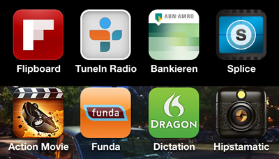 My Top 5 Apps Remember when one of the key recommendations for website design was to avoid lengthy pages? Well how things have changed. Have you seen Beetle.com? In my opinion it’s gone to the other extreme and is a veritable recipe for RSI. Plus it took ages to load. To get to the bottom of the page it took twenty scrolling movements on my mouse. Ouch. Engaging and novel as it is, I was more focused on careful vertical scrolling rather than interacting with anything on the page which would have required some horizontal movement on my behalf. I presume that swiping at the page on the iPad would be less taxing but still a lot of work. That’s not to say that I disagree with providing longer pages that reveal their content in a more dynamic fashion as you scroll. In fact I like it. Citroen, Nike, Rory McIlroy and Italian bag designer Bagigia have less ambitious but arguably more palatable renditions of this feature. Thinking about it, one thing these sites have forgotten about that could be quite apt to this style of presentation is audio. Now how would that work, thoughts? Also have a look at New Zealand and No Leath women’s shoes. Related story: The Extinction of the Scrollbar 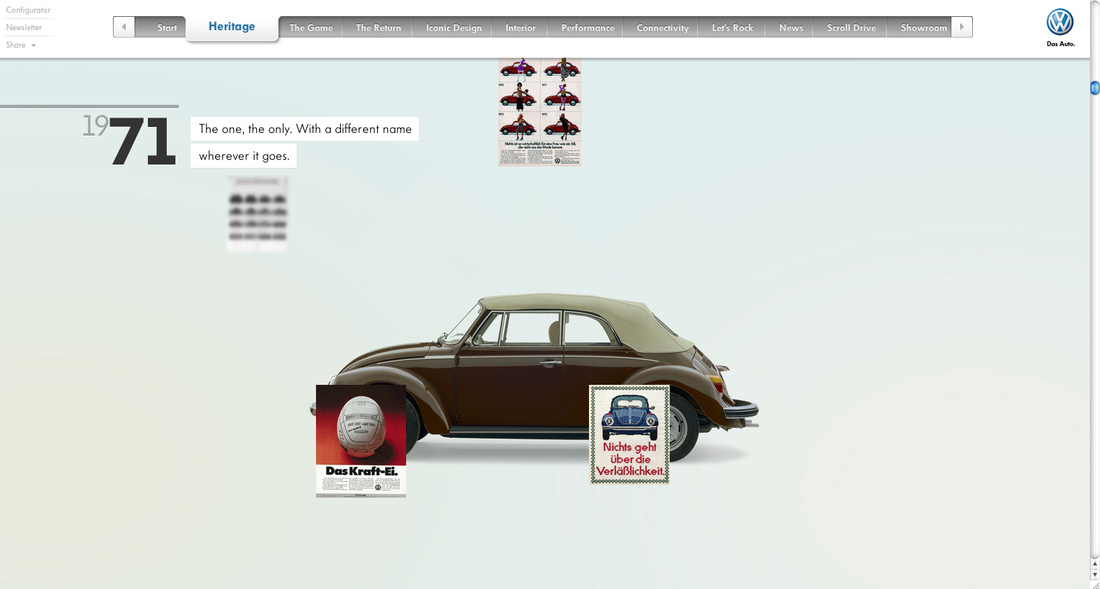 Extreme scrolling at Beetle.com This Easter I was lucky enough to escape to France with a car full of friends. The car hire company presented me with a surprisingly delightful Opel Insignia. I've rarely felt as safe and comfortable in a car. Nice one GM. On our return the weather turned for the worst. Rain, wind, poor visibility ... the works. Coupled with a packed motorway and talkative companions, there was a lot to contend with for me as the driver. At one point I wanted to change the music track being played. Keeping my eyes on the road I fumbled about trying to find the skip-track button with my free hand. After a few moments I managed to change the track but didn't realise that I has also turned off the traction control. Although the car does tell you that this has taken place, the distraction in and around the car meant that it took me a long time to realise what had happened. So what's the point? I guess it'd be better if GM kept controls critical to the safety of the car away from more frequently used button to prevent errors like I've just described. Still, nice car and great holiday. 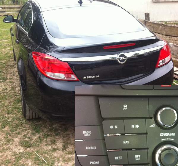 Traction Control button is tool close to the track control button. Looking for flights from Amsterdam to Denver this week, I happened across a very nice design feature on KLM’s mobile website. When choosing your dates for travel, the calendar flips down from the departure/return date controls. Flipboard eat your heart out why don’t you. The trip-type and class-selector also use very attractive iPhone-esque toggles. Not so amazing is the fact that the country selector is hidden below the fold on the homepage and defaults to the USA. This meant that I was scrolling through a list of US airports before I realized that I had to somehow go and change my country of origin. This control only exists on the homepage so returning there, finding and changing it is a tad annoying I must say. This was an issue I was keen to avoid in the design of the Yamaha mobile website recently. Still, the fresh mobile-tailored design is enough for me to be happy to use KLM’s website on my iPhone. 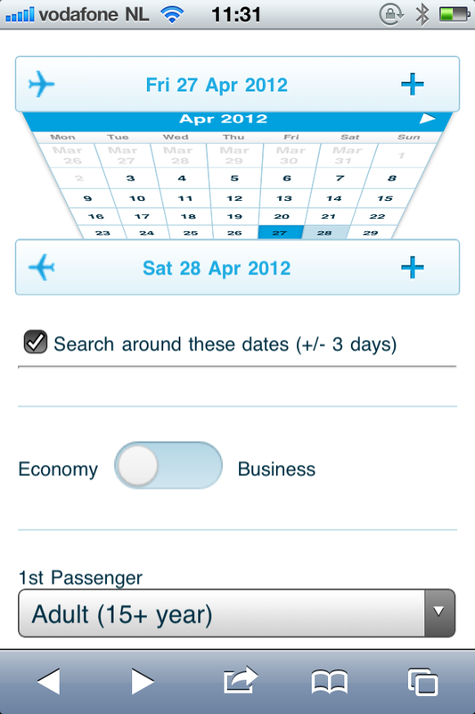 Shows the calendar in the process of flipping down from the departure date control. |
WelcomeI'm Frank Gaine. Strategist, Designer, Manager, Founder, Educator. 
Archives
April 2022
|
 RSS Feed
