|
To my family, Skype IS talking over the internet, sorry Apple. We all have Apple products yet we still use Skype and not FaceTime. Maybe its because we started using Skype with Windows products and old habits die hard. Anyhoo, despite Skype’s popularity it seems they are still making applications with fuzzy navigation. Version 3.5.454 of the Skype app for iPhone has one particularly annoying issue. When you try calling an online contact and the call is ended because they do not pick up, you end the call or something else happens you are brought to the messaging menu for that contact (see below). I can possibly see Skype's point of view here; if you can’t call them, message them. However, the reality was that I spent a long time wondering how I ended up on the messaging screen when the last thing I saw before putting the phone to my ear was my family member’s contact details with options to make a video call, chat or send an sms. When a call fails in this way the most likely thing I want to do is to try calling them again. When an error happens it's best to return users to where they were before the error occurred and explain the issue and recommended actions from there. You with me? 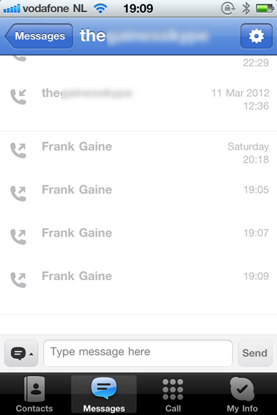 Shows the message screen that appears if a call fails.
0 Comments
Below is the remote control for my new Philips TV. Let's get straight to it. I never know which way is up, I can never find the mute button quick enough, it keeps slipping off the couch, I can't see it in a darkened room, it feels too light and cheap. Need I continue? Might be worth comparing the Sky remote control. With this classic piece of ergonomic engineering you always know the back from the front, top from the bottom. Sounds basic but we've seen how it can go wrong. The Sky remote has a rubberised back which sticks nicely to leather or whatever the couches of meer mortals are made of. The layout and shape of the keys make it a doddle to use in the dark. Plus it feels like a quality product, weighty but not heavy, colourful but not gaudy. Interestingly the Sky Remote made it into the Design Museum in London in 2009, along with the O2 Cocoon for which I designed the user interface. Check me out! 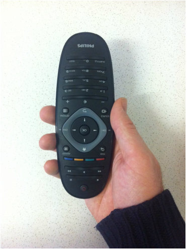 Philips remote control, the wrong way round. As some of you might know, I'm the guy behined App in Seconds. Here's the latest blog from there ... Last week we spoke about the different uses of App in Seconds. Yet another alternative and quirky use for the service has emerged. Tom, a friend of App in Seconds pointed out that he had used it to play a cunning pranks on a friend. Sounds interesting, want to hear the story? Read more at appinseconds.com/blog
So I've finally updated my portfolio website. Well, it's the one I've had all along but initially I thought that I needed to find a more bespoke portfolio experience for my site visitors. I searched for 'UX portfolios', 'create portfolio' and so forth. Results returned the regular off-the-shelf portfolio websites such as Krop, Coroflot, Behance, Cargo Collective and Carbonmade. All of which seemed to be targeted more at photographers, graphic designers, print designers and other such like. They either looked too generic, too restrictive or lacked basic usability. Some were ridiculously expensive. Is there a gap in the market for a UX-specific portfolio service? Maybe but in the meantime you'll have to put up with me shoe-horning screenshots of my previous work into the templates of my current drag-and-drop website provider. Enjoy!
So I've decided to bring all my blogging and writing together on this website ... finally.
|
WelcomeI'm Frank Gaine. Strategist, Designer, Manager, Founder, Educator. 
Archives
April 2022
|
 RSS Feed
