|
I sometimes browse the App Store’s Top 25 or Featured lists, just to see if anything catches my fancy. Unless I’ve already heard good things about an app, the decision to enter the detailed description page is a combination of five factors. The app icon, app name, app publisher, rating and price. All too often apps limit their appeal by not addressing these factors effectively. Take Vyclone for example. It’s difficult to imagine what this app might entail when you look at its fabricated name and ambiguous icon. On the same list we have Captain Antartica. Its icon has a rocket propelled cartoon bird flying through the air and it is published by FDG Entertainment. You simply know it’s a game and can even imagine the kind of gameplay. Vyclone, in case you are interested, allows you to synchronise video taken by multiple people and mash them into one continuous video. Neat. However, Vyclone should have included some nuance of video in their icon and app name. Instead millions will see it in the list of featured apps and never dig any deeper. 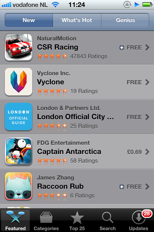 Can you guess what Vyclone is all about?
1 Comment
timesnotforawastin
20/7/2012 00:33:46
Excellent article. Just shows you that you need to think of absolutely everything when designing an app. Just having a good idea is not enough. There's too much competition out there. Leave a Reply. |
WelcomeI'm Frank Gaine. Strategist, Designer, Manager, Founder, Educator. 
Archives
April 2022
|
 RSS Feed
