|
Looking for flights from Amsterdam to Denver this week, I happened across a very nice design feature on KLM’s mobile website. When choosing your dates for travel, the calendar flips down from the departure/return date controls. Flipboard eat your heart out why don’t you. The trip-type and class-selector also use very attractive iPhone-esque toggles. Not so amazing is the fact that the country selector is hidden below the fold on the homepage and defaults to the USA. This meant that I was scrolling through a list of US airports before I realized that I had to somehow go and change my country of origin. This control only exists on the homepage so returning there, finding and changing it is a tad annoying I must say. This was an issue I was keen to avoid in the design of the Yamaha mobile website recently. Still, the fresh mobile-tailored design is enough for me to be happy to use KLM’s website on my iPhone. 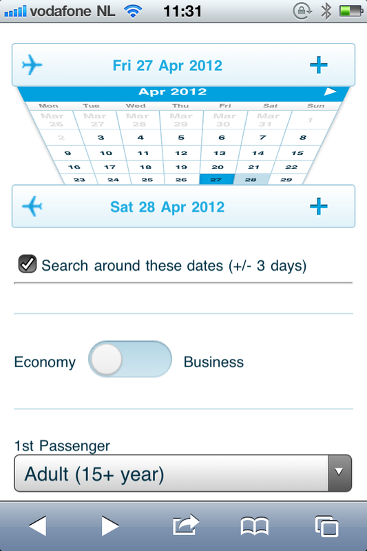 Shows the calendar in the process of flipping down from the departure date control.
0 Comments
Leave a Reply. |
WelcomeI'm Frank Gaine. Strategist, Designer, Manager, Founder, Educator. 
Archives
April 2022
|
 RSS Feed
